The Batman logo is more than just a symbol—it's an icon. Instantly recognizable, it’s come to represent one of the most beloved and enduring superheroes of all time. From its debut in the 1930s to its modern-day status as a pop culture phenomenon, the Batman logo has undergone various transformations, each one reflecting the changes in Batman's character and the world around him. Whether you're a lifelong fan or just beginning to explore Gotham's dark protector, understanding the evolution of the Batman logo offers a fascinating look at how design shapes culture and character. In this article, we’ll take a deep dive into the history and impact of the Batman logo. Visit Seekvectors for more.
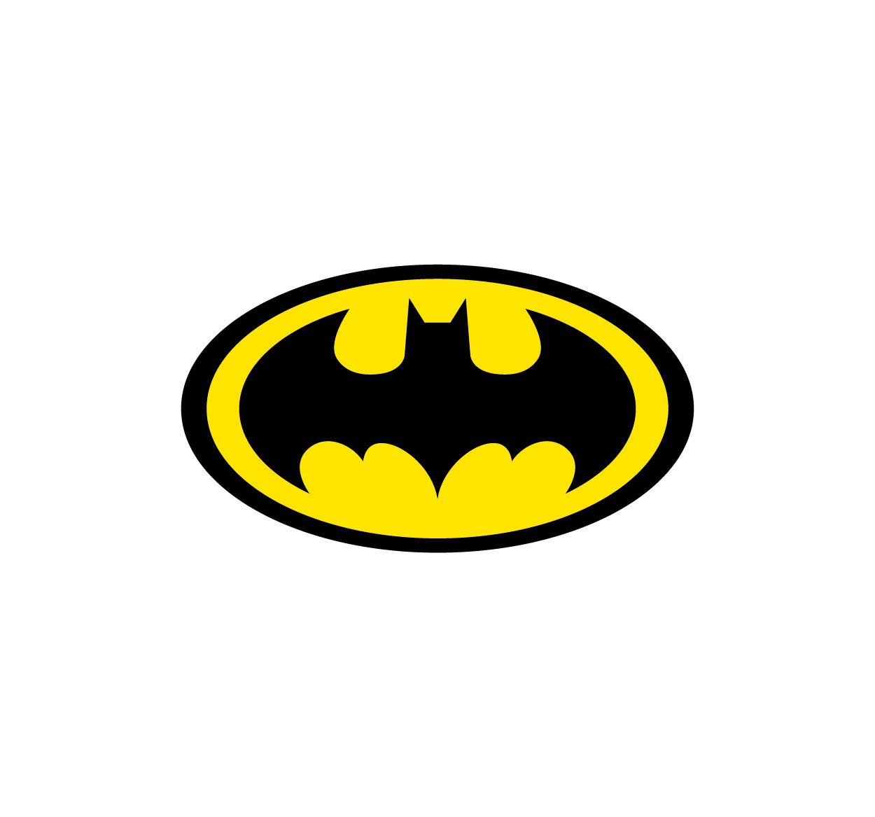
The first iteration of the Batman logo appeared in 1939, just a year after Batman’s creation in Detective Comics #27. Initially, the logo was a simple black bat silhouette placed within a yellow oval. This bat symbol mirrored Batman's mysterious nature, evoking the fear and uncertainty that his character was designed to embody.
At the time, Batman was a much darker and grittier figure, often depicted as a shadowy avenger of the night. This early logo reflected that tone—simple, sharp, and ominous. It was the perfect visual representation of Batman's roots as a vigilante who used fear as his weapon against crime.
However, as the years went on and Batman’s character evolved, so too did the logo. The logo wasn’t just a static element—it began to shift with the changing landscape of comic book culture, reflecting the changes in the character himself.
As Batman's stories became more complex, the logo also underwent several transformations. Each new iteration of the logo was a reflection of both Batman’s growing popularity and the changing tone of his stories.
1940s to 1960s: The early versions of the Batman logo maintained the bat shape and the oval, but the design began to look more polished and less threatening. As Batman's stories became more accessible and less dark, particularly during the campy 1960s "Batman" TV series, the bat symbol became more rounded, with less emphasis on the sharp, angular features that had defined it in earlier decades. The oval was brightened with a yellow background, making the logo more cheerful and less foreboding.
1970s to 1980s: During the darker days of Batman’s storytelling, particularly with the release of Batman: The Dark Knight Returns by Frank Miller, the logo took on a much more severe look. The bright yellow oval was dropped, and the bat symbol became sharper and more aggressive, reflecting Batman’s transformation into a more brooding, solitary figure. This change symbolized the darker, more serious narrative that Batman was becoming known for.
1990s to Present: The late 1980s and early 1990s brought about the rise of Tim Burton’s Batman films, which ushered in a new era for the Batman logo. Burton’s darker, Gothic interpretation of the character needed a logo that matched the tone of his films. The logo became more angular and simplified, ditching the oval in favor of a minimalist design. This version of the logo has remained influential in modern depictions of Batman, particularly in films like Christopher Nolan’s The Dark Knight trilogy.
Despite the numerous changes in the Batman logo over the years, certain elements have remained constant, making it instantly recognizable to fans. Here are some of the core design elements that define the Batman logo:
The Bat Symbol: The bat symbol itself is the heart of the logo. Its shape has evolved, but the bat always retains the same key features—a large, pointed wingspan that evokes the fear and power that Batman represents. The bat shape symbolizes both the character’s origins (his fear of bats) and his mission (to instill fear in Gotham’s criminals).
The Yellow Oval: The yellow oval background, which became synonymous with Batman’s earlier appearances, is a symbol of boldness and strength. While the modern logo often omits it, it’s an essential element in Batman’s identity, particularly in his Silver Age comic book appearances. The yellow oval helped make Batman's logo pop visually, making it stand out on comic book pages.
Minimalism and Modern Adaptations: More recent versions of the logo focus on clean, sharp lines with no extraneous details. This reflects the modern approach to Batman’s character—a no-nonsense, intensely focused superhero. The minimalist approach has made the logo suitable for a variety of media, including movies, merchandise, and video games.
The Batman logo has become one of the most iconic and recognized symbols in popular culture. Its significance goes beyond the world of comic books and films—it has transcended into merchandise, advertisements, and even tattoos. The logo's ability to evoke a sense of power, justice, and fear has made it a go-to symbol for everything from consumer products to social justice campaigns.
The simplicity of the logo, paired with its deep associations with heroism and the fight against crime, has made it a timeless emblem. People see the bat symbol and instantly think of Gotham, justice, and Batman himself. In addition, the logo’s evolution has made it relevant across multiple generations, ensuring that it remains as fresh and impactful today as it was when it was first designed.
In modern adaptations, such as the Batman v Superman films or the more recent Batman movie, the logo remains a central part of Batman’s identity. Each film’s iteration of the logo reflects the darker tone of the movie, with a focus on sharp edges and minimalist designs. The logo’s presence in these films serves not only as a visual cue for fans but also as a reminder of Batman's enduring legacy.