Menu

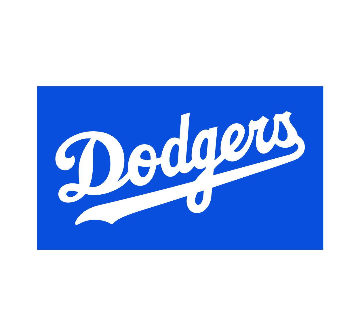
The Los Angeles Dodgers logo is one of the most iconic symbols in Major League Baseball (MLB). Known for its rich history, the logo has evolved alongside the team, reflecting changes in the organization while maintaining a deep connection to its roots. From the classic "LA" emblem to the iconic script design, the Dodgers logo has become synonymous with excellence and tradition in baseball. In this article, we will take a look at the Dodgers logo’s history, its design evolution, and the symbolism behind it. Understanding the meaning of the Dodgers logo helps fans and design enthusiasts alike appreciate the visual identity that has helped the team become a cultural icon. For more sports branding insights, visit Seek Vectors.
The Dodgers franchise has a long and storied history, dating back to its founding in 1883. Initially known as the Brooklyn Dodgers, the team underwent several name and logo changes before settling on the current Los Angeles Dodgers logo.
Early Designs (1880s-1930s)
The Brooklyn Dodgers initially used simple, text-based logos that focused primarily on the team name. In the early years, logos were less sophisticated and more utilitarian, reflecting the straightforward nature of baseball branding at the time.
Introduction of the ‘Dodgers’ Script (1930s-1950s)
In the 1930s, the Dodgers began using a more distinctive logo with the script “Dodgers” written in cursive, which became a signature design for the team. This cursive script was an early version of the logo that would go on to represent the team for decades. It evoked a sense of classic Americana, connecting the team with its blue-collar roots in Brooklyn.
The Move to Los Angeles (1958)
After relocating to Los Angeles in 1958, the Dodgers’ branding remained largely unchanged. However, the logo underwent a redesign to reflect the modern, glamorous atmosphere of LA. The incorporation of the “LA” initials became a key part of the team’s identity, allowing for a more universal appeal.
While the Dodgers logo has remained relatively consistent over the years, it has undergone several key changes that have helped it evolve with the times. Let’s break down the major phases of its evolution:
The Classic Script Logo (1950s-1980s)
The cursive script logo, featuring the word “Dodgers”, remained a staple of the team’s visual identity for several decades. This version was simple yet elegant, signifying the team’s rich history while maintaining a timeless appeal. During this period, the logo became synonymous with the Dodgers' success and dominance in Major League Baseball.
The ‘LA’ Emblem (1980s-Present)
The “LA” initials were introduced in the 1980s, marking a major shift in the team’s branding. This logo featured a clean, modern design that was instantly recognizable. The use of the “LA” symbol solidified the team’s connection to its new home in Los Angeles, a city known for its entertainment industry and global influence. The simplicity of the design also made it easy to use across various mediums, from merchandise to stadium signage.
The Contemporary Script and ‘LA’ Hybrid (2000s-Present)
In recent years, the Dodgers logo has combined both the cursive script and the “LA” initials. This hybrid version of the logo balances tradition with modernity, showcasing the Dodgers’ commitment to both their history and their place in Los Angeles culture. The combination of the classic Dodgers script and the sleek LA emblem reflects the team’s legacy and future aspirations.
The Dodgers logo is more than just a design—it’s a symbol of the team’s values, culture, and rich history. Here are the key elements of the logo and their symbolic meanings:
The Cursive Script
The cursive “Dodgers” script reflects the team’s long and storied history. It invokes feelings of nostalgia and tradition, connecting the team to its roots in Brooklyn and its dedication to excellence in baseball. The fluidity of the script suggests the graceful, yet dynamic, movement of baseball players on the field.
The “LA” Initials
The “LA” in the logo ties the team directly to Los Angeles, symbolizing the city’s influence on the team’s culture. The sleek, modern typography of the “LA” initials also conveys a sense of speed and agility, mirroring the fast-paced nature of baseball itself.
The Color Blue
The primary color in the Dodgers logo is blue, which symbolizes trust, loyalty, and strength. It’s a color that is often associated with the Dodgers’ long-standing fanbase and their commitment to community and tradition. Additionally, blue is a color that resonates with both the team’s local and global audiences, reflecting the team’s broad appeal.
The Dodgers logo is one of the most iconic symbols in professional sports, and its influence extends beyond the baseball field. Here’s how the logo has shaped the team’s branding:
Global Recognition
The Dodgers logo is recognized worldwide, making it one of the most powerful brand marks in sports. The simplicity and elegance of the design ensure that it resonates with fans around the globe, regardless of language or culture. Whether in Asia, Europe, or North America, the Dodgers’ logo evokes passion and excitement for the sport.
Merchandise and Fan Culture
The logo’s impact is especially evident in Dodgers merchandise. From jerseys to hats, the logo is one of the best-selling sports symbols in the world. It plays a significant role in fan culture, with supporters proudly wearing the logo to represent their allegiance to the team.
Cultural Influence
The Dodgers logo is not just a sports brand—it's a part of Los Angeles' identity. The team’s success has helped elevate the city’s cultural standing, and the logo itself is intertwined with Hollywood, entertainment, and the broader fabric of LA life.