The Eagles logo is more than just a symbol; it’s an embodiment of the Philadelphia Eagles’ identity, history, and fierce competitive spirit. Whether you're a long-time fan or new to the NFL, the logo instantly evokes feelings of power, resilience, and pride. But what is the story behind this iconic emblem? Why did the Eagles choose an eagle to represent their team? And how has the logo evolved over the years to become a symbol of more than just a sports team? In this article, we’ll take a closer look at the history, meaning, and evolution of the Eagles logo, offering insights into how this emblem represents more than just a football team—it’s a symbol of passion, legacy, and community. Visit Seekvectors for more.
The Philadelphia Eagles were established in 1933, but their logo has undergone several transformations over the years. From their humble beginnings, the team adopted the eagle as a symbol—reflecting the power, agility, and determination of the bird, which mirrored the qualities they wanted their football team to embody.
The eagle is not just an iconic bird; it’s also a symbol of freedom, courage, and strength—perfect qualities for a team that represents the city of Philadelphia, a city known for its resilience and fight. The first version of the Eagles logo featured a simple, traditional design with the eagle placed inside a shield. This design was classic and easily understood, establishing the foundation for future iterations of the team’s identity.
Throughout its history, the Eagles logo has evolved, adapting to the changing times while maintaining the core values of strength, pride, and resilience. Let’s look at some key milestones in the logo’s transformation.
In the 1940s, the Eagles logo was a simple, clean design featuring a shield with an eagle’s head on it. This logo reflected the team’s military-themed identity during the war years, aligning with the nation’s sense of pride and strength. The logo was heavily influenced by the traditional heraldic designs seen in military insignias, with a bold, straightforward look that spoke to the team’s toughness and determination.
As the Eagles moved into a new era, so did their logo. In the 1960s, the team went through a redesign that would set the foundation for their modern identity. The new logo focused on a more dynamic and realistic eagle, capturing the essence of flight and speed. The eagle was now more focused on movement, with its wings spread wide in an action-packed pose.
This redesign not only reflected the changing aesthetic of the team but also symbolized the Eagles’ readiness to take flight—suggesting that they were not just grounded in the past, but ready to soar to new heights.
The 1990s marked a new era for the Eagles, with the team undergoing another major logo redesign. This version of the logo featured a bold eagle in flight with a sharp, fierce profile. It emphasized motion and aggression, reflecting the aggressive playing style of the team during this period. The sharp lines and bold angles represented the team’s commitment to power and speed on the field.
The 1996 redesign removed the shield element entirely, focusing entirely on the dynamic and aggressive nature of the eagle, making the logo feel more modern and relevant to the times.
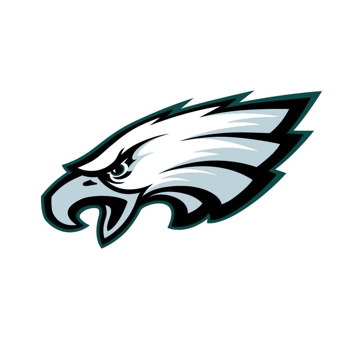
The current version of the Eagles logo was introduced in 1996 and has seen only slight modifications since. It features a detailed, fierce eagle head in profile, with clean, sharp lines and a streamlined design that represents power, agility, and speed. The modern logo reflects the Eagles’ commitment to excellence, emphasizing their dynamic presence both on and off the field.
The color palette also changed with this iteration, adopting the team’s now-iconic midnight green, black, silver, and white. This sleek and modern design represents not just the team’s physical attributes but also the city of Philadelphia’s spirit of grit and determination.
The Eagles logo is packed with symbolism, reflecting the team’s identity, values, and connection to the city of Philadelphia. Here’s a breakdown of the key elements that make the logo so powerful:
The Eagle: The eagle has always been a symbol of freedom, strength, and courage. For the Eagles, it represents their will to overcome obstacles, soar above their competition, and achieve greatness. The eagle’s wings spread wide symbolize the team’s desire to take flight and rise to new heights, both in terms of success on the field and their place in the history of the NFL.
The Fierce Profile: The eagle’s sharp, intense gaze in the modern logo reflects the team’s aggressive approach to the game. It speaks to their relentless pursuit of victory and their fierce competitiveness. The boldness of the design highlights the Eagles’ toughness and commitment to their fans.
The Color Scheme: The midnight green color represents the Eagles’ connection to the city of Philadelphia, while also evoking feelings of growth, resilience, and ambition. Black and silver add a modern, sleek touch, giving the logo a timeless, adaptable quality.
The Motion: The eagle’s dynamic stance in the logo symbolizes speed and power, key attributes of the Eagles’ style of play. It reflects the team’s readiness to rise to the occasion and take on any challenge.
The Eagles logo is much more than a brand symbol—it’s a rallying cry for the team and its fans. The design has evolved over time, but the core message remains the same: the Eagles are powerful, determined, and relentless. The logo inspires not only the team but also the fans, who wear it with pride and embody the spirit of the bird itself—resilient, focused, and always striving for more.
Fans proudly display the logo on jerseys, hats, and accessories, and it has become a cultural icon for the city of Philadelphia. It connects people to the team and to each other, fostering a sense of community and shared passion.