The Ford logo is one of the most recognizable symbols in the world, carrying with it a rich history of automotive innovation, American craftsmanship, and brand evolution. From its humble beginnings in the early 1900s to its status today as a symbol of reliability and quality, the Ford logo has undergone several transformations, each reflecting the company’s growth and its constant drive to stay at the forefront of the automotive industry. Whether you’re a car enthusiast or someone curious about the history behind one of the world’s most iconic brands, understanding the Ford logo’s journey offers valuable insights into both the company and its legacy. In this article, we’ll take a closer look at the Ford logo, exploring its evolution, symbolism, and the key moments that made it the global icon it is today. For more on branding and design, visit Seek Vectors.
The Origins of the Ford Logo
Ford’s history begins with Henry Ford’s vision to make automobiles accessible to the average person. Founded in 1903, the company initially did not focus on branding, but as Ford’s popularity grew, so did the need for a strong visual identity.
The first Ford logo, introduced in 1903, was simple: just the word “Ford” in a bold font. At the time, it was all about functionality, and the logo reflected the company’s no-frills approach to car manufacturing. However, as Ford introduced innovations like the assembly line and the Model T in the 1910s, it became clear that a more sophisticated logo was needed to match the company's groundbreaking impact on the automotive world.
Evolution of the Ford Logo
Over the years, the Ford logo has undergone several key transformations, each reflecting the changing times and the company’s evolution. Here’s a look at how the logo has changed over the decades:
Early Days: 1903–1927
When Ford was founded in 1903, the company’s logo was simply the word “Ford” in bold capital letters. This was functional and straightforward, which matched the company's early days focused on mass production. As Ford expanded, the logo evolved to match its growing influence.
The Iconic Script Logo: 1927–1950s
In 1927, Ford introduced its first major redesign with the use of a script-style logo. This new logo was elegant, reflecting the company’s newfound focus on quality and innovation. It was meant to emphasize the luxury and sophistication that Ford was beginning to associate with its products, such as the Model A.
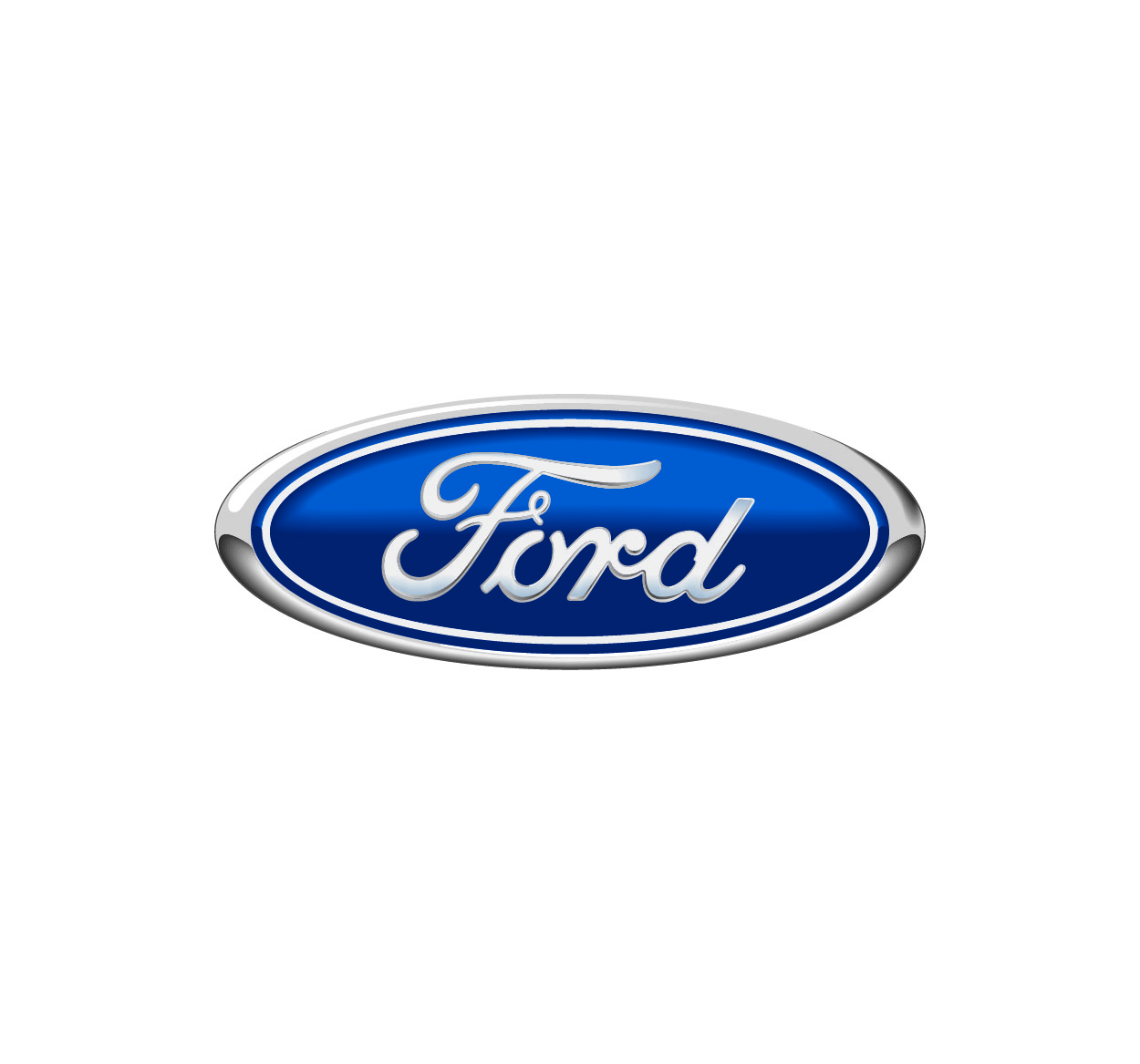
The Blue Oval: 1960s–Present
Perhaps the most iconic change to the Ford logo came in the 1960s when the company introduced the blue oval. This was a radical departure from the earlier script design. The blue oval was meant to reflect the company’s modern, global ambitions while also evoking trust, stability, and reliability. The blue color has always been associated with loyalty and confidence, which are key attributes of the Ford brand.
Refinements and Digital Age: 2000s–Present
While the fundamental design of the blue oval has remained intact, the Ford logo has undergone subtle tweaks over the years. In the early 2000s, the logo saw some digital improvements to make it more appealing on computer screens and digital platforms. The font was updated to be sleeker, and the overall design became more polished, reflecting the brand's focus on innovation in the digital era.
Symbolism Behind the Ford Logo
The Ford logo carries with it more than just a simple design; it’s packed with meaning and symbolism that reflects the company’s values and its place in automotive history.
The Oval Shape: The oval shape has been a hallmark of the Ford logo since its introduction in the 1960s. It represents the world of possibilities, a symbol of Ford’s ability to deliver vehicles that are practical, accessible, and capable of meeting diverse customer needs. The oval is also meant to signify continuity and unity, as Ford’s vehicles connect people to their own lives and journeys.
The Blue Color: The use of blue in the logo is not just an aesthetic choice; it’s symbolic of trust, loyalty, and reliability—values that Ford has prided itself on for more than a century. Blue also conveys a sense of stability, making it the perfect color for a brand committed to creating long-lasting, dependable cars.
The Script Font: The script-style font used in early Ford logos and carried over to later versions adds a touch of elegance. It evokes a sense of quality and craftsmanship, aligning with Ford’s initial focus on luxury and precision engineering. Even today, this font remains part of Ford's identity, maintaining a connection to its rich history.
Ford’s Logo and Brand Identity
The Ford logo has played a critical role in shaping the company’s brand identity. Here’s how it has impacted Ford over the years:
Instant Recognition: The Ford logo is one of the most recognizable in the world. The blue oval, paired with the brand’s association with high-quality cars, trucks, and SUVs, has made it an iconic symbol. Whether you see it on a billboard, a dealership sign, or the front of a truck, the Ford logo instantly signals trust and innovation.
Consistency in Branding: Despite the evolution of the logo’s design, Ford has maintained consistency in its use of the blue oval. This consistency has helped Ford remain one of the most reliable and recognizable automotive brands worldwide. The logo serves as a constant reminder of the company’s long-standing reputation for producing durable and dependable vehicles.
Emotional Connection: The Ford logo is deeply connected to American identity and pride. It represents the pioneering spirit of Henry Ford and his commitment to mass production, making cars affordable for the everyday person. The logo evokes nostalgia for generations of drivers, particularly in the United States, who grew up with Ford vehicles.
Global Impact: While Ford is rooted in American history, its influence has spread worldwide. The Ford logo has become synonymous with automotive innovation, and the brand’s vehicles can be found on roads across the globe. The logo serves as a beacon of Ford’s continued push toward creating cars and trucks that meet the needs of people everywhere.