The Fortnite logo has become one of the most recognizable symbols in the gaming world. Since its release in 2017, Fortnite has captured the attention of millions of players, becoming not just a game but a cultural phenomenon. The logo, with its bold design, is synonymous with the game’s fun and fast-paced battle royale action. In this article, we’ll take a closer look at the Fortnite logo’s evolution, its design choices, and the meaning behind it. Understanding the logo’s journey helps us appreciate the role it plays in the overall success of Fortnite as a gaming and entertainment powerhouse. For more insights into brand design and digital media, visit Seek Vectors.
When Fortnite was first launched, its logo was simple and designed to reflect the fun, cartoonish style of the game. However, as the game became more popular and expanded, so did the need for a more recognizable and dynamic logo.
Early Logo Design (2017)
The original Fortnite logo used a simple, bold typeface, reflecting the playful and action-packed nature of the game. The Fortnite wordmark was rendered in an angular, blocky style, suggesting strength and action. The early logo perfectly matched the game’s vibrant, cartoon-inspired graphics and tone.
Introduction of the Iconic Shield (2018)
As Fortnite grew in popularity, the logo evolved to include a more symbolic shield element. This shield, which is used in promotional materials and branding, symbolizes the defense and survival aspects of the game. Players are tasked with building defenses and outlasting opponents, which makes the shield a fitting addition to the logo.
Over time, the Fortnite logo has undergone several changes, adapting to the growth of the game and its expansion into multiple platforms and media forms.
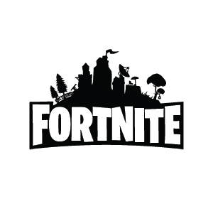
The Bold, Impactful Font (2018-2020) (H3)
By 2018, the Fortnite logo was given a cleaner, more modern look, featuring a thicker, bold font that stood out in advertisements and branding materials. The font became more refined, and the letters became smoother, while maintaining an edge to represent the game's bold, competitive nature.
Collaborations and Thematic Updates (2020-Present) (H3)
Fortnite’s collaborations with various media franchises, including Marvel, Star Wars, and DC Comics, led to changes in the Fortnite logo for special events. These temporary alterations involved adding iconic symbols or integrating the look and feel of the collaborating brands. The logo continued to be updated, maintaining flexibility while still staying true to its core identity.
The Current Logo (2021-Present) (H3)
The most recent Fortnite logo has maintained the bold font and shield design, while also integrating a more refined and sleek visual style. It reflects Fortnite’s evolution from a simple battle royale game to a global entertainment platform, where players can not only battle but also watch live concerts and enjoy other interactive experiences.
The Fortnite logo is more than just a graphic; it carries deep symbolism that reflects the game’s values and its position in the gaming community. Here’s a breakdown of the key elements of the logo and what they represent:
The Bold Typeface
The thick, bold letters in the Fortnite logo symbolize strength, competitiveness, and energy. It visually conveys the high-energy gameplay of Fortnite, which is fast-paced and action-oriented. The font’s solid appearance also reflects the game’s foundation in building and fortifying structures.
The Shield
The shield element of the logo represents defense, survival, and protection—all core aspects of Fortnite’s gameplay. Players must often build structures and fight to defend their positions against opponents. The shield also implies strength, suggesting that Fortnite players are not just competitors but warriors in a battle for survival.
The Iconic Fort
The fort or structure theme is tied to the very nature of Fortnite, where building defensive structures is a key part of the gameplay. The logo reflects the need for players to craft and protect their positions on the battlefield.
The Fortnite logo plays a central role in the brand’s success and is recognized worldwide. It has contributed significantly to the game’s popularity and cultural impact.
Global Recognition
The simplicity and boldness of the Fortnite logo have made it a recognizable symbol in gaming and pop culture. From Fortnite merchandise to branding across social media platforms, the logo serves as a beacon for players and fans worldwide.
Cross-Platform Success
As Fortnite expanded to different platforms, the logo remained consistent, creating a unified identity for the game across consoles, PCs, and mobile devices. Its adaptability made it effective in a variety of marketing materials, ensuring that the game was easily identifiable across different devices.
Cultural Influence and Events
The Fortnite logo has become a part of pop culture, thanks to the game’s involvement in virtual concerts, movie collaborations, and live events. The logo plays an important role in defining the game as a platform for social interaction and entertainment beyond traditional gameplay.