Designing a logo is one of the most important steps in building your brand’s identity. It’s the first thing people notice about your business, and it can communicate a lot about your values, personality, and message. Whether you're creating a logo for a new business, a personal project, or an established brand, a strong logo can make a huge difference in how you’re perceived. This guide will take you through the key steps involved in designing a logo, from brainstorming ideas to choosing the perfect color palette and typography. Ready to make your own logo? Keep reading to learn how! For more design inspiration and tips, visit Seek Vectors.
Before diving into how to create a logo, it's important to understand why logos matter in the first place. A logo isn’t just a pretty picture – it’s a critical part of your brand’s identity. It communicates who you are, what you stand for, and how you want your customers to perceive your business.
Instant Recognition
A great logo helps your audience instantly recognize your brand. It becomes a shorthand for everything your business stands for. Think about Nike’s swoosh, Apple’s apple, or McDonald’s golden arches – these logos are simple yet universally recognized and synonymous with their brands.
Building Trust
A well-designed logo gives your business credibility. It shows that you take your brand seriously and that you’re committed to offering quality products or services.
Consistency
Logos create consistency across all your marketing materials, from websites to business cards. They help unify your brand's presence, making it easier for customers to identify and engage with your company.
Creating a logo involves several steps, and it’s important to approach each step with care and thoughtfulness. Here's how you can make a logo that stands the test of time:
Before you start sketching ideas, you need to define your brand. Understanding your business’s mission and values is crucial for creating a logo that accurately reflects what you stand for.
Who is your audience?
Think about the people you’re trying to reach. Are you targeting young, trendy consumers, or older, more traditional buyers? Your logo should appeal to the preferences of your target demographic.
What are your core values?
Consider what your brand represents. Are you focused on innovation? Sustainability? Luxury? Make sure your logo communicates these values clearly.
What’s your brand personality?
Is your brand playful or serious? Bold or subtle? Your logo should reflect your brand's personality through its design, color, and style.
Now that you have a clear understanding of your brand, it's time to start brainstorming ideas. Think about:
Symbols: What kind of symbols relate to your brand’s identity? For example, a tech company might use geometric shapes to convey modernity, while a bakery might use an image of wheat or a rolling pin.
Wordmark or Icon? Do you want your logo to be text-based (like Coca-Cola’s script) or a simple symbol (like Apple’s apple)? A combination mark (text + icon) is another popular option.
Typography: The font you choose is just as important as the logo’s icon. It should reflect the mood of your brand – sleek and modern for a tech brand, or playful and bold for a children’s brand.
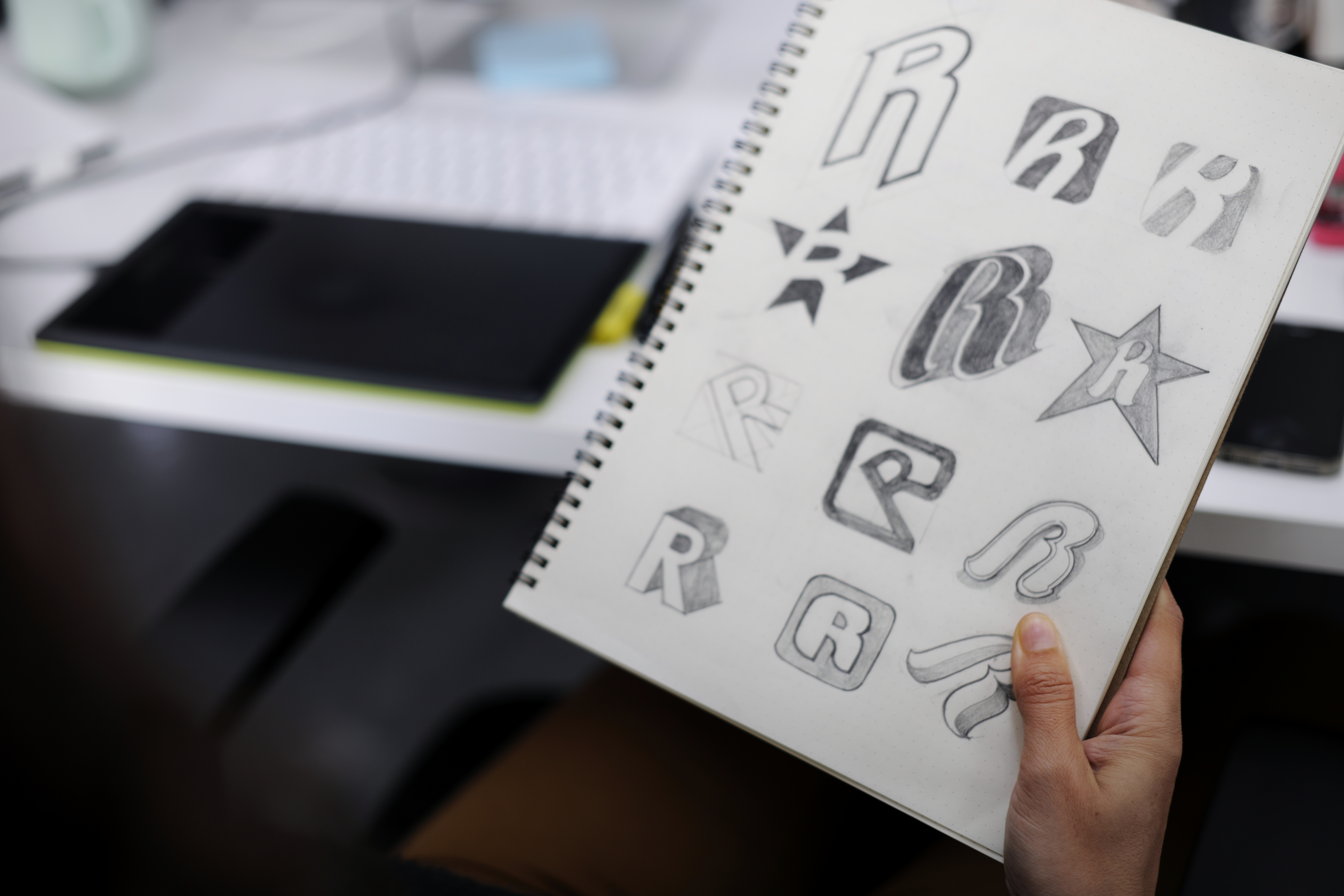
Put your ideas on paper or in a design tool. At this stage, don’t worry about making things perfect; just focus on getting your concepts out. Experiment with different layouts, shapes, and styles.
Try combining multiple concepts. For example, how would your brand’s name look inside a shape? What happens if you flip the design upside down? Don’t be afraid to play around and explore various options until you find something that resonates with your vision.
Colors evoke emotions and set the tone for your brand. Here’s how to choose the right colors:
Blue: Often associated with trust, professionalism, and calmness. Commonly used by tech companies and financial institutions (think IBM and Facebook).
Red: Represents energy, passion, and excitement. Great for brands that want to convey boldness (think Coca-Cola or YouTube).
Green: Often linked to nature, health, and sustainability. Perfect for eco-friendly or wellness brands (like Whole Foods).
Black and White: Classic and versatile, black and white logos work well for luxury brands or any company that wants a clean, minimalist look.
Your logo’s font should match your brand personality. Some guidelines to keep in mind:
Serif Fonts: These fonts are classic and formal, making them great for luxury, financial, or legal brands (e.g., Times New Roman).
Sans-serif Fonts: Modern, clean, and easy to read, sans-serif fonts work well for tech, health, or youth-focused brands (e.g., Helvetica).
Script Fonts: For a more personal, elegant touch, script fonts can give a sense of sophistication (think Coca-Cola).
Make sure the font you choose is legible, especially when scaled down for smaller uses like social media icons or business cards.
Let’s take a look at a few iconic logos and why they work so well:
Nike – The Swoosh
Nike’s logo is simple, yet it communicates motion and speed. The swoosh is sleek and elegant, perfectly complementing the brand’s focus on sports and athleticism.
Apple – The Apple
Apple’s logo is simple yet powerful. The sleek, bitten apple represents creativity, innovation, and simplicity – all core to the brand’s identity.
McDonald's – The Golden Arches
The golden arches are one of the most recognized logos worldwide. The simplicity and bright color make the brand instantly identifiable, symbolizing fast, convenient food.
By studying these famous logos, you can learn valuable lessons about simplicity, memorability, and visual storytelling.