Designing a logo is one of the most important steps in establishing your business identity. A great logo can elevate your brand and make it easily recognizable to your target audience. But how do you design a logo that stands out? In this article, we’ll guide you through the essential steps to design a logo that reflects your brand's values and personality. From brainstorming ideas to choosing the right color palette and typography, we’ll cover everything you need to know. Whether you’re creating a logo for a startup or a well-established business, these tips will help you create a memorable and effective design. For more design resources and inspiration, visit Seek Vectors.
A logo is not just a symbol; it’s the face of your brand. It tells your customers who you are and helps them easily recognize your business. Here’s why logo design matters:
Brand Recognition
A unique and memorable logo helps customers recognize your brand at a glance. Whether it's on a website, social media, or print materials, your logo serves as a visual anchor for your brand’s identity.
First Impressions Matter
Your logo is often the first impression a potential customer will have of your brand. A well-designed logo communicates professionalism, trust, and quality.
Builds Consistency
A well-designed logo provides consistency across all marketing materials, including your website, business cards, and advertisements. It unifies your brand and strengthens your identity.
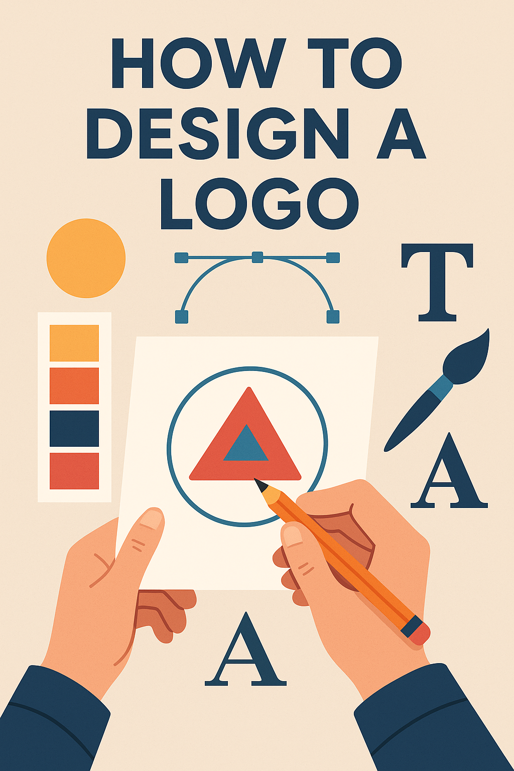
Creating a logo requires a thoughtful approach to ensure it represents your brand effectively. Here are the essential steps to follow:
Before starting the design process, it's important to understand your brand’s essence. Consider the following:
What are your brand's core values?
What message do you want to convey?
Who is your target audience?
Answering these questions will help guide your design and ensure it accurately reflects your business.
Once you understand your brand, begin brainstorming ideas. Sketch out different concepts that reflect your brand’s identity. Don’t worry about perfection at this stage; focus on getting your ideas down on paper.
Think about:
Symbols: What icons, shapes, or imagery align with your brand's message? For example, a tech company might use sleek, futuristic symbols, while a food brand might opt for warm, inviting imagery.
Typography: The font you choose will have a significant impact on the overall look of your logo. Choose a font that matches your brand’s tone—whether it’s bold, playful, elegant, or professional.
Colors play a critical role in how your brand is perceived. Each color evokes a different emotion, so it’s important to choose colors that reflect your brand's values:
Red: Passion, excitement, energy
Blue: Trust, professionalism, calm
Green: Nature, health, sustainability
Black: Luxury, sophistication, elegance
Keep your target audience and the emotions you want to evoke in mind when selecting your color palette.
Fonts are just as important as your logo's icon and color scheme. When choosing a font:
Serif fonts (e.g., Times New Roman) are classic and elegant, often used for luxury brands.
Sans-serif fonts (e.g., Arial, Helvetica) are modern, clean, and easy to read, suitable for tech and startup companies.
Script fonts convey a personal or artistic touch, making them ideal for creative brands.
Ensure the font is readable and works well in various sizes.
After you’ve created a few design concepts, refine them by testing their scalability and versatility. A great logo should look good on everything, from business cards to billboards. Make sure your design works in both color and black-and-white formats.
Seek feedback from others, whether it’s friends, colleagues, or a professional designer, to refine your design further.
While designing a logo, be mindful of these common mistakes to ensure your logo is effective and professional:
Overcomplicating the Design
Keep it simple. A cluttered or overly complex logo can confuse potential customers. Focus on creating a clean, minimalistic design that’s easily recognizable.
Using Generic Fonts or Icons
Avoid using stock logos or overused icons. A unique, custom design will make your brand stand out and show that you’ve put thought into your logo.
Ignoring Scalability
Your logo should look great in any size. Whether it’s on a mobile screen or a giant billboard, make sure your logo remains legible and impactful.
Here are a few examples of iconic logos that have become synonymous with their brands:
Nike – The Swoosh
Nike’s simple, yet powerful swoosh is a timeless symbol that evokes speed and motion. It’s a perfect example of how a simple design can have a lasting impact.
Apple – The Apple Icon
The sleek, minimalistic apple logo reflects innovation, elegance, and simplicity—qualities that are integral to the brand’s identity.
McDonald's – The Golden Arches
The bold, golden arches have become one of the most recognizable logos in the world. Its simplicity and bright color make it stand out and symbolize fast, convenient food.