In the fast-paced world of online retail, Seekvector empowers e-commerce entrepreneurs to go beyond product listings by mastering the art of visual merchandising. Today’s consumers are highly visual. They make purchase decisions within seconds of landing on your site. That’s why product presentation is no longer a luxury—it’s a necessity. At Seekvector, we believe your digital storefront should captivate, guide, and convert.
Visual merchandising in e-commerce is about creating an immersive and cohesive visual journey that mirrors an in-store experience. From homepage banners to product thumbnails, every visual element should work toward one goal: increasing sales and customer satisfaction. In this article, we'll explore how you can use Seekvector's proven merchandising techniques to optimize user experience and maximize revenue.
Visual merchandising refers to the design and arrangement of product visuals and web elements to influence buying behavior. With Seekvector’s methodology, the goal is to make navigation intuitive, boost product visibility, and simplify the path to purchase.
Key elements include:
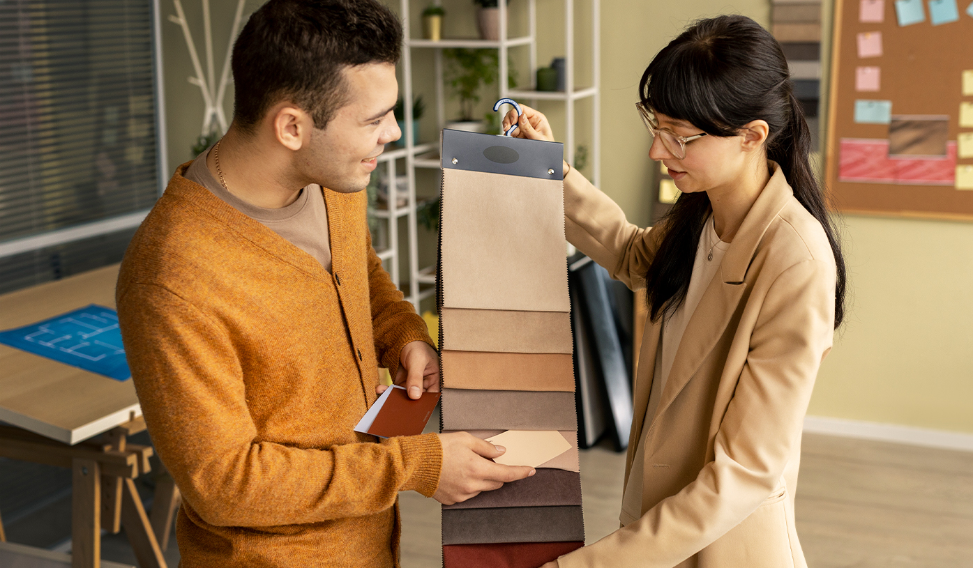
Clean, professional product photography
Category and subcategory layouts
Responsive grid structures
Visual hierarchy in typography and buttons
Banner designs and promotional graphics
When these elements are optimized, customers feel more confident, spend more time exploring your store, and are more likely to convert.
📊 Fact: Studies show that 90% of online buyers consider image quality the most important factor when making a purchase decision.
Seekvector recommends a combination of visual tactics that elevate your e-commerce site from functional to exceptional:
Hero Banners: Use fullscreen images to highlight seasonal collections, flash sales, or new arrivals.
Product Thumbnails: Display clean, cropped images in a uniform format with hover effects that show alternate views.
Interactive Galleries: Let users zoom, rotate, or swipe through multiple product angles.
Lifestyle Photography: Showcase products in context (e.g., a desk lamp on a designer table).
Color Filtering & Tags: Enable users to filter by color, style, or material visually.
By helping users visualize ownership, Seekvector-style merchandising bridges the gap between browsing and buying.
The product page is your final opportunity to win the customer. Seekvector insists on a high-conversion layout that includes:
High-res product images from various angles
Images with scale (e.g., model wearing the product or a size chart visual)
Sticky CTA buttons like "Add to Cart" and "Buy Now"
Customer photo reviews to build authenticity
Keywords in image alt text like “Seekvector men’s wristwatch black leather”
Ensure your page loads fast and adapts seamlessly across devices. Mobile-first visual merchandising is a priority, as over 70% of shoppers use smartphones.
Visual cues aren't just about aesthetics—they help guide users across your website. Seekvector’s UX-first design tips include:
Use icons (e.g., truck for shipping, gift for bundles) to reinforce CTA buttons
Implement breadcrumb navigation with visual separators
Display tooltips or quick views when hovering over products
Use color psychology—like green for “in stock” and red for urgency ("Only 2 left!")
Also, keep your layout consistent to reduce cognitive load and encourage seamless shopping.
With Seekvector’s approach, continuous optimization is key. You can’t improve what you don’t measure. Here’s how to track success:
Use heatmaps to monitor where users click or hover the most
A/B test banner layouts or product gallery formats
Analyze cart abandonment rates to optimize visual prompts
Track click-through rates on promotional visuals
Monitor image-based engagement via social proof (e.g., "300 people viewed this today")
🧠 Insight: Brands that updated product visuals every 30 days saw a 24% increase in conversion rate.