Color plays a vital role in vector design, influencing mood, brand identity, and user experience. Understanding how to use color effectively can make the difference between a professional and an amateur design. Whether you're designing a logo, an illustration, or an interface, mastering color selection ensures your visuals are both aesthetically pleasing and impactful. In this guide, we’ll explore color theory, choosing color palettes, working with gradients, and ensuring accessibility in vector design.
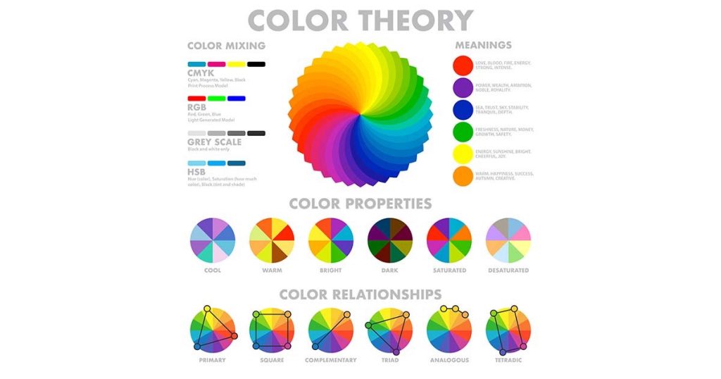
To create visually appealing designs, it's essential to understand the fundamentals of color theory.
Primary, Secondary, and Tertiary Colors – The foundation of all color schemes.
Color Harmony – Complementary, analogous, and triadic color schemes help maintain balance.
Psychology of Color – Different colors evoke specific emotions and reactions.
Using color theory principles helps designers craft compositions that resonate with their audience.
📌 Related Article: Color Psychology in Graphic Design
Selecting the right color palette ensures your vector graphics look cohesive and professional.
Use Color Palette Generators – Tools like Adobe Color or Colors help find harmonious color schemes.
Consider Branding – Stick to brand guidelines for consistency.
Test on Different Backgrounds – Ensure visibility across dark and light modes.
💡 Pro Tip: Save and reuse color swatches in your vector design software for efficiency.
📌 Related Article: How to Create a Brand Color Palette
Gradients and color blending add depth and dimension to vector artwork.
Linear vs. Radial Gradients – Linear gradients are great for backgrounds, while radial gradients work well for focal points.
Opacity and Transparency – Adjusting opacity levels can create smooth transitions between colors.
Mesh and Freeform Gradients – Advanced gradient techniques available in tools like Adobe Illustrator.
📌 Related Article: How to Use Gradients in Adobe Illustrator
Accessibility is key to making vector designs inclusive and user-friendly.
Use High Contrast – Ensure text is legible on any background.
Test with Accessibility Tools – WCAG-compliant tools help verify contrast ratios.
Avoid Overuse of Bright Colors – Too many bright colors can overwhelm users.
📌 Related Article: Designing for Accessibility: A Guide