The logo de Senati is one of the most recognizable emblems in Peru’s technical education sector. More than just a visual identity, the logo represents quality, innovation, and industrial progress. In this article, we take a deep dive into the origin, meaning, and design evolution of the Senati logo — a powerful symbol of the institution's mission and values.
Senati (Servicio Nacional de Adiestramiento en Trabajo Industrial) was established in 1961 to train professionals in technical and industrial fields. From the beginning, the logo played a central role in representing Senati's commitment to excellence in education and industry. The original logo design emphasized seriousness, precision, and technical training.
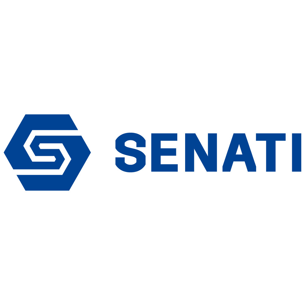
The modern Senati logo is structured, minimal, and industrial — all carefully designed to reflect the institution's core identity. Key visual elements include:
Gear Wheel: Symbolizing industrial work, mechanics, and hands-on training.
Typography: Bold capital letters convey authority, structure, and professionalism.
Color Blue: A strong visual cue for trust, stability, and modernity, often associated with technology and education.
Together, these elements form a cohesive brand that communicates Senati’s dedication to practical, future-ready learning.
Over the years, the logo de Senati has seen subtle updates to remain relevant in a digital-first world. These refinements include:
Smoother, more modern typography
Simplified iconography for better digital adaptability
Improved scalability for use across print, web, signage, and uniforms
Despite visual updates, the essence of the logo — rooted in industrial precision and technical education — has remained intact.
The logo is a vital part of Senati’s branding and is used consistently across:
Official documents
Student uniforms
Campus signage
Online platforms
Marketing materials
This consistency reinforces brand identity and builds trust with students, corporate partners, and the public. The logo serves as a visual guarantee of quality education and skilled workforce development.
Unlike other technical education institutions that often use generic symbols like books or graduation caps, Senati’s logo stands apart with its clean, mechanical design. It communicates a laser focus on practical, real-world skills and avoids overly academic visuals.
This industrial-forward branding positions Senati as a serious, forward-thinking training center aligned with Peru’s industrial growth.
The Senati logo is much more than a symbol — it is a reflection of the institution’s identity, values, and mission. As Peru continues to invest in technical education and workforce development, the Senati logo will remain a strong emblem of excellence, innovation, and industrial strength.
Whether printed on a student’s badge or displayed on a digital screen, this logo consistently communicates trust, skill, and progress.