The McDonald's logo is one of the most recognized symbols in the world. Known for its bright yellow golden arches, the logo has become synonymous with fast food, convenience, and global branding. But how did this simple design evolve into a global icon? Let’s explore the history and meaning behind the McDonald's logo.
The story of the McDonald's logo begins in the 1950s. When architect Stanley Meston designed the first franchised McDonald’s restaurant, he included two large golden arches on the building. These arches soon became a visual cue for the brand.
By 1961, McDonald's redesigned its logo to incorporate these arches into a stylized “M”. This bold and simple graphic became the foundation of what we now know as the McDonald's logo.
1961 – Introduction of the overlapping “M” using the arches
1975 – Arches refined, enclosed in a red rectangle for contrast
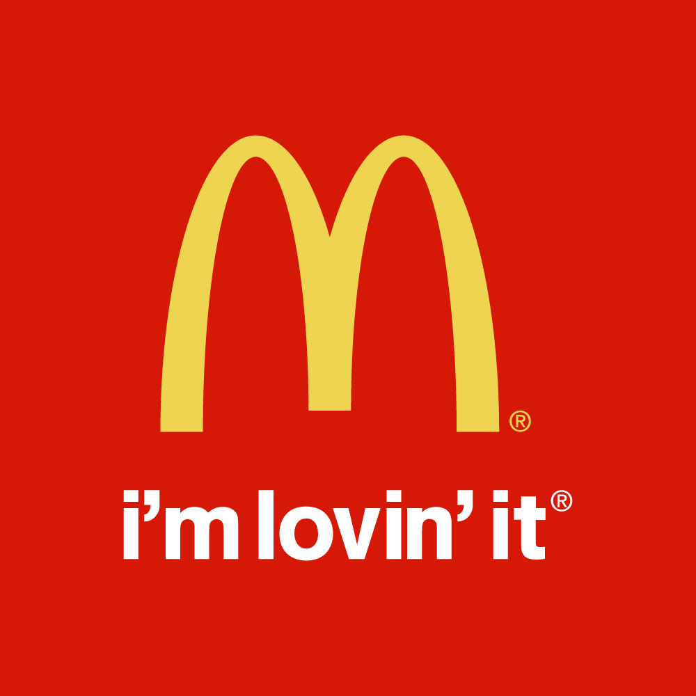
2003 – "I’m Lovin’ It" slogan added with the logo in campaigns
2006–present – Minimal flat version with only the golden “M”
Despite the changes, the McDonald's logo has always maintained its iconic yellow arches, reflecting consistency and global familiarity.
Golden Arches: Represent nourishment, happiness, and brightness
Yellow Color: Associated with joy, energy, and attention-grabbing
Simple “M” Shape: Memorability and brand recall
Red Background (in older versions): Stimulates appetite and urgency
The McDonald's logo communicates more than just a restaurant. It represents a brand experience trusted by billions across the globe.
Visually distinctive and easy to recognize from afar
Universally understood – no text needed to identify the brand.
Consistent design across decades, building brand loyalty
Adaptable in both physical and digital formats
Whether it’s on a highway sign or a mobile app, the logo remains unmistakable.
The golden arches are so iconic that in some countries, McDonald's doesn’t even need to display the full name on signage. The “M” alone is enough to pull people in.
If you’re a designer, brand strategist, or blogger covering global logos, the McDonald's logo is a top-tier case study in simplicity, consistency, and mass appeal. Including it in branding articles can also improve keyword performance due to high search volume.
The McDonald's logo is more than a corporate symbol — it's a cultural landmark. From its architectural roots to its modern flat design, it reflects how a simple shape can tell a powerful story. Whether you're analyzing brand success or just curious about famous logos, the golden arches are the perfect example of timeless design.