The Roblox logo is more than just a symbol – it represents a gaming platform that has evolved from a small startup to one of the largest and most popular entertainment platforms in the world. From its inception in 2004 to the present day, Roblox has become synonymous with creativity, community, and cutting-edge gaming technology. The logo has undergone several transformations, each marking a key milestone in the platform's growth and success. In this article, we’ll dive into the history of the Roblox logo, examine its design evolution, and understand the deeper meaning behind its iconic elements. Whether you’re a lifelong Roblox fan or new to the platform, understanding the logo’s journey offers valuable insight into the brand’s identity and what it represents to its millions of users.
For more insights into branding and design, visit Seek Vectors.
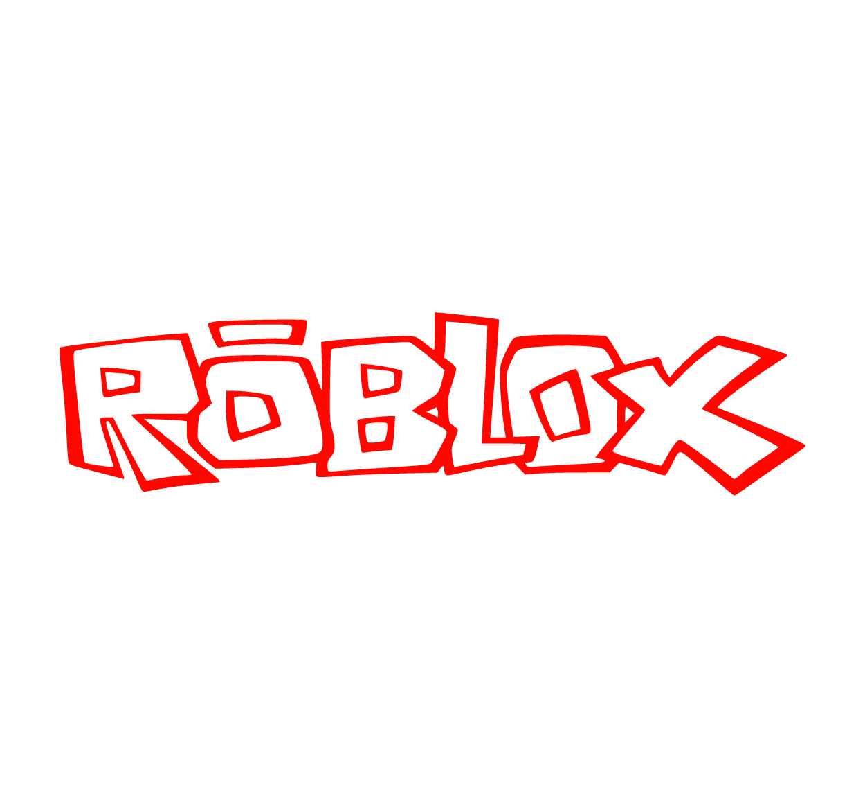
The Origins of the Roblox Logo
The journey of the Roblox logo began in 2004 when the platform first launched as a simple gaming and creation site. At that time, Roblox aimed to offer users the ability to build and play games created by others. The first version of the Roblox logo was straightforward and functional. It featured basic geometric shapes and a blocky font that highlighted the platform’s focus on creativity and construction. It was a fitting symbol for a website dedicated to building virtual worlds, where players could design their own experiences from scratch.
Though simple, this early logo set the tone for Roblox’s identity – a platform built on imagination and hands-on creativity. However, as the platform began to grow and gain a larger user base, it was clear that a more refined and modern logo would be necessary to reflect its evolving vision and expanding capabilities.
The Evolution of the Roblox Logo
As Roblox expanded, it shifted its focus from a simple game-building site to a global community where millions of players could create, share, and enjoy games. With this shift in focus, the logo had to evolve to represent the company’s ambitious goals better. Around 2013, Roblox introduced a major redesign of its logo. The new logo featured a sleeker, more modern font and incorporated an angular "R," which became a key visual element of the brand.
The 2013 redesign also featured a cleaner look that allowed the logo to stand out more prominently across various digital platforms. This update reflected Roblox's focus on innovation, with the bold “R” symbolizing the cutting-edge technology that powered the platform’s growth.
In 2017, Roblox took things a step further with another update, introducing a 3D version of the logo. This version made the logo feel more dynamic and futuristic, perfectly aligning with Roblox’s transition into a global gaming phenomenon. The boldness and sharpness of the design gave the platform a distinctive look that was easily recognizable in a crowded market.
Each iteration of the logo has mirrored Roblox’s journey from a small, creative platform to a massive entertainment ecosystem that includes games, social experiences, and even virtual economy systems.
The Meaning Behind the Roblox Logo
The Roblox logo is not just a random collection of shapes and colors—it holds a deeper meaning that reflects the platform’s core values. The angular "R" stands as a symbol of creativity, building, and construction, which are at the heart of what Roblox represents. The sharp, geometric shapes in the logo reflect the platform’s emphasis on user-generated content and the ability to create new worlds and experiences.
The red color in the logo is another important element, evoking energy, excitement, and passion. It’s a bold choice that reflects the vibrant and active community within Roblox. The red "R" is not only eye-catching but symbolizes the platform's dynamic nature, constantly evolving and improving as it grows.
As Roblox became a hub for creators, players, and developers alike, the logo evolved to represent these various facets of the platform. It’s a visual symbol of the freedom and creativity that players have when they step into the Roblox universe, where anything is possible.
The Impact of the Roblox Logo on Its Brand Identity
The Roblox logo has played a significant role in shaping the brand’s identity and its appeal to players around the world. Its instantly recognizable design has helped Roblox become a household name in the gaming industry. The simplicity yet boldness of the logo ensures it stands out in a crowded marketplace, making it easy for users to identify Roblox products, games, and events.
But the logo is more than just an image—it’s become a symbol of the creative possibilities that Roblox offers. For millions of players, the logo represents a space where they can express themselves, build their games, and connect with a global community. As Roblox continues to innovate and expand its offerings, the logo will undoubtedly evolve again, but its core message of creativity, community, and empowerment will always remain at the forefront.