In the mobile-first era, Seek Vector emphasizes that responsive design isn’t just a trend — it’s a fundamental requirement for websites aiming to attract, retain, and engage users across devices. From smartphones and tablets to large desktops, users expect seamless browsing experiences. A failure to deliver can lead to higher bounce rates, lower conversions, and missed business opportunities.
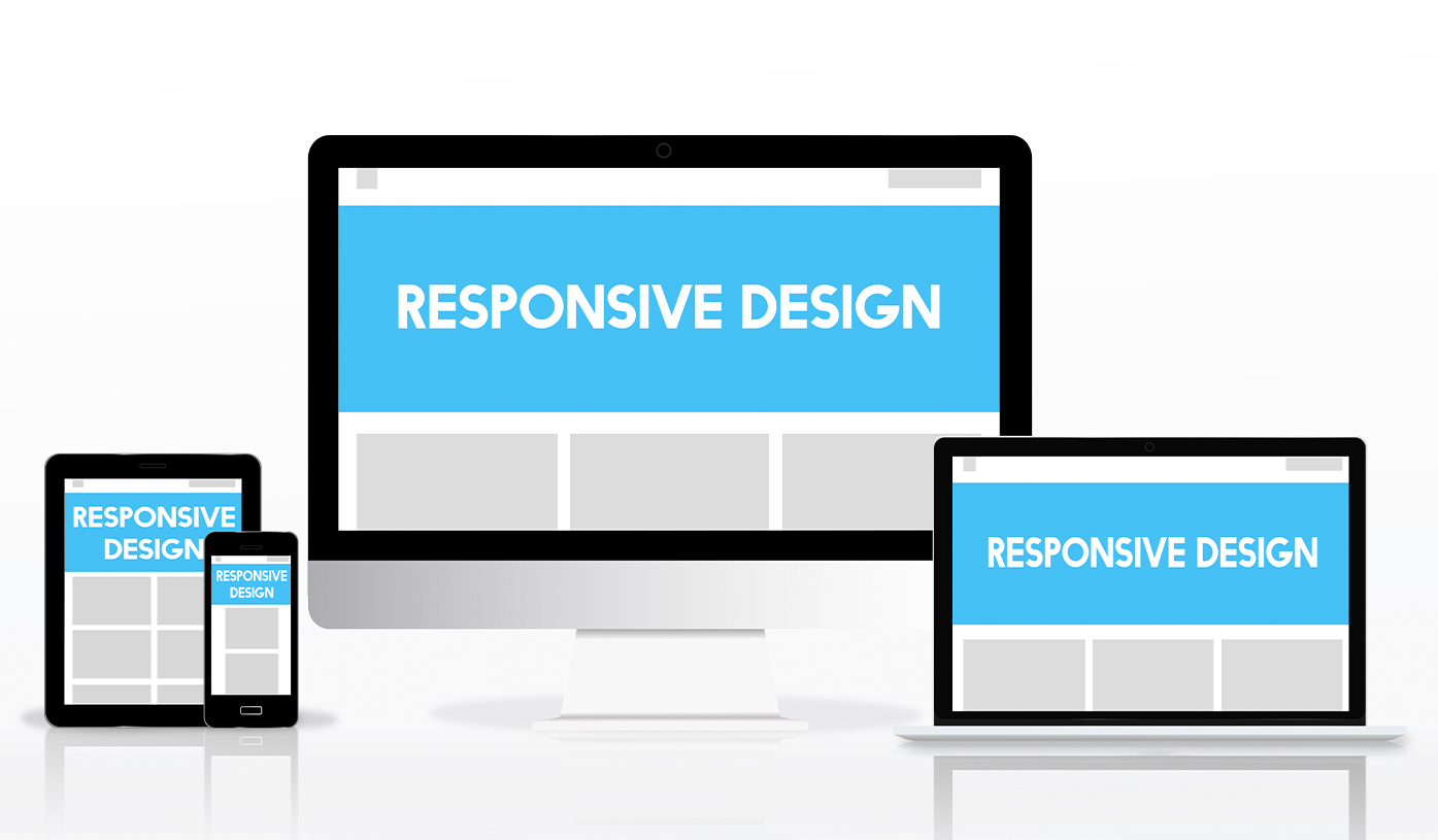
Responsive design ensures that your content adapts fluidly to different screen sizes and resolutions. It’s about creating a website layout that looks great and functions perfectly, no matter how it's accessed. With Seekvector’s responsive design strategies, tech startups and businesses alike can ensure that every visitor — mobile or desktop — enjoys a frictionless experience that encourages longer sessions, higher engagement, and ultimately, better results.
This guide explores the core benefits of responsive design and why implementing it is essential to modern user engagement.
Responsive design directly affects how users interact with your content. A responsive website adapts to each user’s screen and provides the best possible viewing and interaction experience.
Increased Mobile Traffic: Over 60% of web traffic comes from mobile devices.
Lower Bounce Rates: Visitors stay longer when a site is readable and easy to navigate.
Higher Conversion Rates: Better UX leads to more signups, purchases, and interactions.
Improved SEO: Google prioritizes mobile-friendly and responsive sites in search rankings.
🧠 Fact: According to Think with Google, 53% of mobile users abandon sites that take longer than 3 seconds to load — responsive designs are optimized to reduce these delays.
Seekvector encourages starting the design process with mobile screens and scaling up. This ensures your content remains accessible and effective even on the smallest screens.
Implementation Tip:
Design for a single-column layout first, using larger fonts and thumb-friendly buttons.
A fluid grid system allows content to scale proportionally, making sure nothing breaks when screen sizes change.
Use percentage-based widths (width: 100%)
Avoid fixed-pixel layouts
Typography should scale with screen size using relative units like em, rem, or vw.
Implement srcset for image flexibility.
Use lazy loading for performance optimization.
Compress images for faster loading.
Alt text: Seekvector-responsive-layout-example showing flexible grid layout adapting on multiple screen sizes
User engagement is more than time on site — it’s about meaningful interactions. Seekvector’s data shows that responsive websites consistently outperform static ones in engagement metrics.
30% increase in page views per session
20% decrease in bounce rate
Up to 40% increase in mobile conversion rates
Simplified navigation for mobile
Fast-loading content that feels native
No need for pinch-to-zoom or side-scrolling
🔗 Read: Seekvector’s Guide to Mobile UX Optimization
Figma: For responsive design wireframes
Tailwind CSS: For utility-first responsive development
Google Lighthouse: For auditing mobile performance
Mobile-first layout
Scalable fonts and media
Optimized image loading
Breakpoints defined for major devices
Consistent CTA placement across screens
Alt text: Developer using Seekvector tools to test responsive behavior on desktop, tablet, and mobile