In the digital landscape, seekvector highlights visual hierarchy as one of the most powerful yet underused design tools in modern websites. It determines what your users see first, where they go next, and how easily they engage with your content. With so much competing for a user’s attention, establishing a clear and purposeful layout isn’t just helpful—it’s essential.
Seekvector’s web design approach teaches that visual hierarchy is more than just “looking good.” It organizes content in a way that speaks to the subconscious, directing attention and enhancing usability. From typography and spacing to color contrast and element size, good visual hierarchy enables a smooth and intuitive user experience.
In this guide, we’ll explore why visual hierarchy matters, how to apply its core principles, and how Seekvector tools can help you structure beautiful, high-converting layouts.
Visual hierarchy is the arrangement of elements to show their importance. Without it, your website may feel confusing, cluttered, or hard to navigate—even if the content is excellent.
Guides user behavior: Visitors are drawn toward high-priority items like CTAs or headlines.
Improves readability: Organized content is easier to scan and digest.
Boosts conversions: When users find what they need faster, they’re more likely to act.
📊 According to a Seekvector usability report, users form an opinion about a website in just 0.05 seconds—and visual hierarchy plays a key role in that first impression.
Here are the most important design techniques Seekvector recommends to build an effective visual hierarchy:
Larger items attract more attention. Use big, bold fonts for headings and progressively smaller text for subheadings and body content.
Headlines (H1): 32–48px
Subheadings (H2/H3): 20–28px
Body text: 16–18px for readability
Colors help separate content sections and signal importance. Use brand colors for CTAs and neutral shades for background or secondary items.
High contrast between text and background improves accessibility.
Warm, saturated tones draw more attention than cool, muted ones.
Typography hierarchy ensures users know what’s most important at a glance.
Stick to 2–3 typefaces max.
Use font weight (bold, medium, light) to create structure.
Italics or all-caps can emphasize sub-elements when used sparingly.
Whitespace helps avoid visual clutter and creates breathing room. Elements aligned consistently make scanning easier.
Use grid systems to align text and images.
Avoid cramming elements together—let each section "breathe."
Seekvector offers modular layout templates based on proven UX patterns. Each section is built with hierarchy in mind, guiding the user from top-level info down to calls to action.
Alt text: Seekvector layout template with defined headline, subhead, and button hierarchy
Buttons and icons are designed to stand out using:
Vibrant color contrast
Size variation
Clear positioning (above the fold or alongside headings)
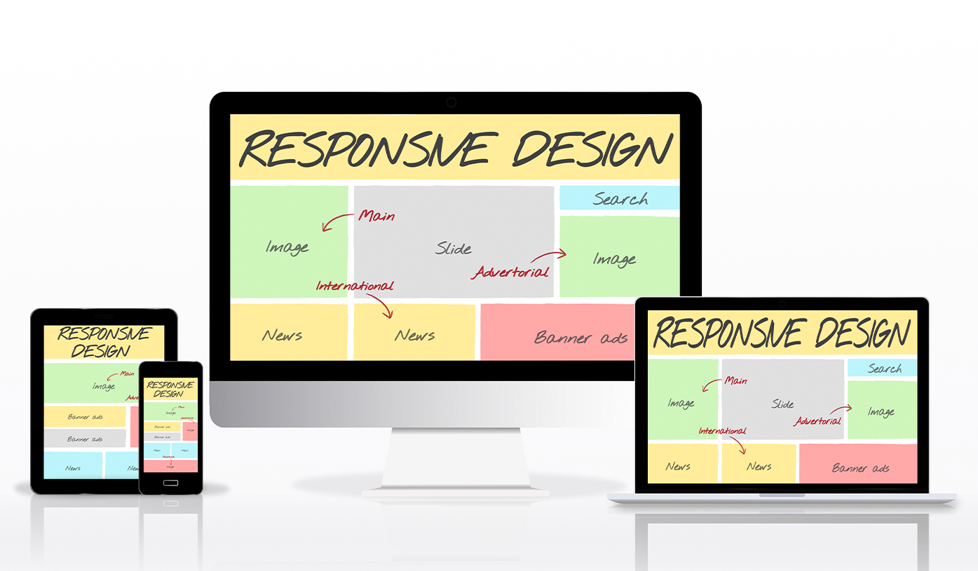
Seekvector’s tools ensure your visual hierarchy scales across devices:
Headings resize proportionally on smaller screens.
Mobile-first breakpoints ensure no overlap or stacking issues.
Touch-friendly buttons maintain clarity and spacing.
🔗 Learn more: Seekvector Responsive UI Principles