The TikTok logo is more than just a design—it's a global icon. When TikTok first hit the digital scene, it was a platform for short-form music videos. Over the years, it evolved into a social media powerhouse that transcended borders, bringing music, creativity, and trends to millions. But behind the viral dances and catchy soundtracks lies a story of design evolution. In this article, we’ll dive into the journey of the TikTok logo, how it became a symbol of modern youth culture, and why it continues to stand out in a crowded social media space. Whether you're a brand designer, a social media enthusiast, or simply curious about the power of a good logo, this article will give you the inside scoop on one of the most recognizable logos in the world. Visit Seekvectors for more.
TikTok, launched in 2016 under the name "Douyin" in China, initially had a simple logo that featured basic text and a musical note, aligning with its original purpose: a short-form music video platform. When it later rebranded to TikTok in 2017 for the international market, the logo underwent a major transformation. The design was sleek, modern, and instantly recognizable—qualities that helped it stand out among other social platforms. At the time, the rebrand aimed to reflect TikTok's dynamic and energetic personality while embracing its musical roots.
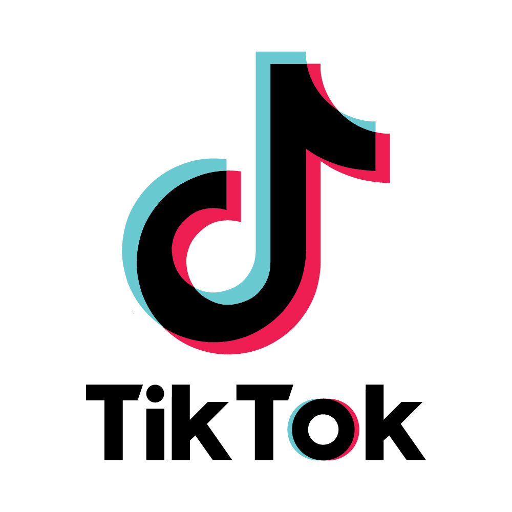
The first global iteration of the TikTok logo, designed by the agency Lippincott, cleverly fused a 'D' with a musical note. This combination emphasized both the app’s focus on music and its ability to help users discover and share creative content. The logo was designed to convey both movement and energy, a visual representation of the platform's pulse.
TikTok’s current logo is clean and minimalist, composed of a black-and-white color scheme with vibrant neon accents. The neon pink and blue tones pop out from the black background, giving the logo an energetic vibe, while the iconic 'D' note keeps the brand anchored in music. The simplicity of the design makes it versatile, adaptable across platforms, and instantly recognizable on various screens and sizes.
The musical note in the logo isn’t just a random design element; it’s a reflection of TikTok’s roots in the music industry. Since its launch, TikTok has become synonymous with viral music challenges, dance trends, and global artists. The logo captures this perfectly, as the note represents the rhythm and beats that the platform thrives on. The sleek, bold font used for "TikTok" in the logo gives the brand a modern, youthful feel that resonates with its target audience—Generation Z and millennials who are active creators and consumers of digital content.
In addition to being visually appealing, the simplicity of the design makes it easy to reproduce, ensuring that it works well across diverse mediums. Whether it’s displayed on a tiny mobile screen or as a large billboard, the logo remains effective and visible.
The TikTok logo isn't just a symbol—it's a key player in TikTok's branding success. The design team understood the importance of visual identity. In the fast-paced world of social media, where trends can come and go, a strong, easily recognizable logo can make a massive difference in a brand’s success. TikTok’s logo communicates the brand's purpose clearly and instantly: fun, energy, music, and creativity.
TikTok’s minimalist approach to logo design also aligns perfectly with the platform’s content. The app is all about quick, impactful moments—15 to 60-second videos that deliver a punch of entertainment. The logo, with its clean lines and bold colors, mirrors this focus on concise, creative expression. It tells users exactly what to expect: short bursts of entertainment that grab your attention.
As the platform grew, the TikTok logo was also adapted to fit the global market. Its universal design made it accessible and recognizable across different cultures, languages, and user demographics. This universal appeal played a big part in TikTok's global rise, helping the platform become one of the most downloaded apps worldwide.
Today, the TikTok logo is more than just a brand mark; it has become a cultural phenomenon. With TikTok videos going viral daily, the logo is now seen everywhere—on TV ads, billboards, merchandise, and social media feeds. The logo has even become a symbol of digital culture itself. Think about the last viral dance you saw—it likely had the TikTok logo somewhere in the background or as part of the video itself.
The platform’s influence on pop culture cannot be overstated. From influencing music charts to launching internet celebrities into stardom, TikTok has reshaped how we view entertainment and social media. And as the logo has become synonymous with creativity and virality, it has cemented its place in the cultural zeitgeist.
As TikTok continues to evolve and expand its reach, the logo will likely continue to serve as a strong visual anchor for the platform’s brand identity. The minimalist design ensures that the logo won’t feel dated or out of place as trends shift. TikTok has already proven that its design team knows how to adapt to changing tastes and digital landscapes, which suggests the logo will remain relevant for years to come.
As the app grows and adapts to new technologies, such as augmented reality and virtual reality, we may even see the TikTok logo evolve further—perhaps taking on new forms or meanings as the platform continues to shape our digital lives.