The Twitter X logo marks a significant change in the platform’s identity. Following Twitter's acquisition by Elon Musk in 2022, the platform underwent a major rebranding, with the Twitter logo evolving into the sleek "X" design. This new logo symbolizes the transformation of Twitter into "X," a platform for all things digital, and represents a departure from its bird logo. In this article, we’ll explore the history of the Twitter X logo, its design elements, and what it signifies for the future of the platform. We’ll also provide insights into how this rebranding reflects broader shifts in social media and tech branding. For more on branding and logo design, visit SeekVectors.
1. The Transition from Twitter to X
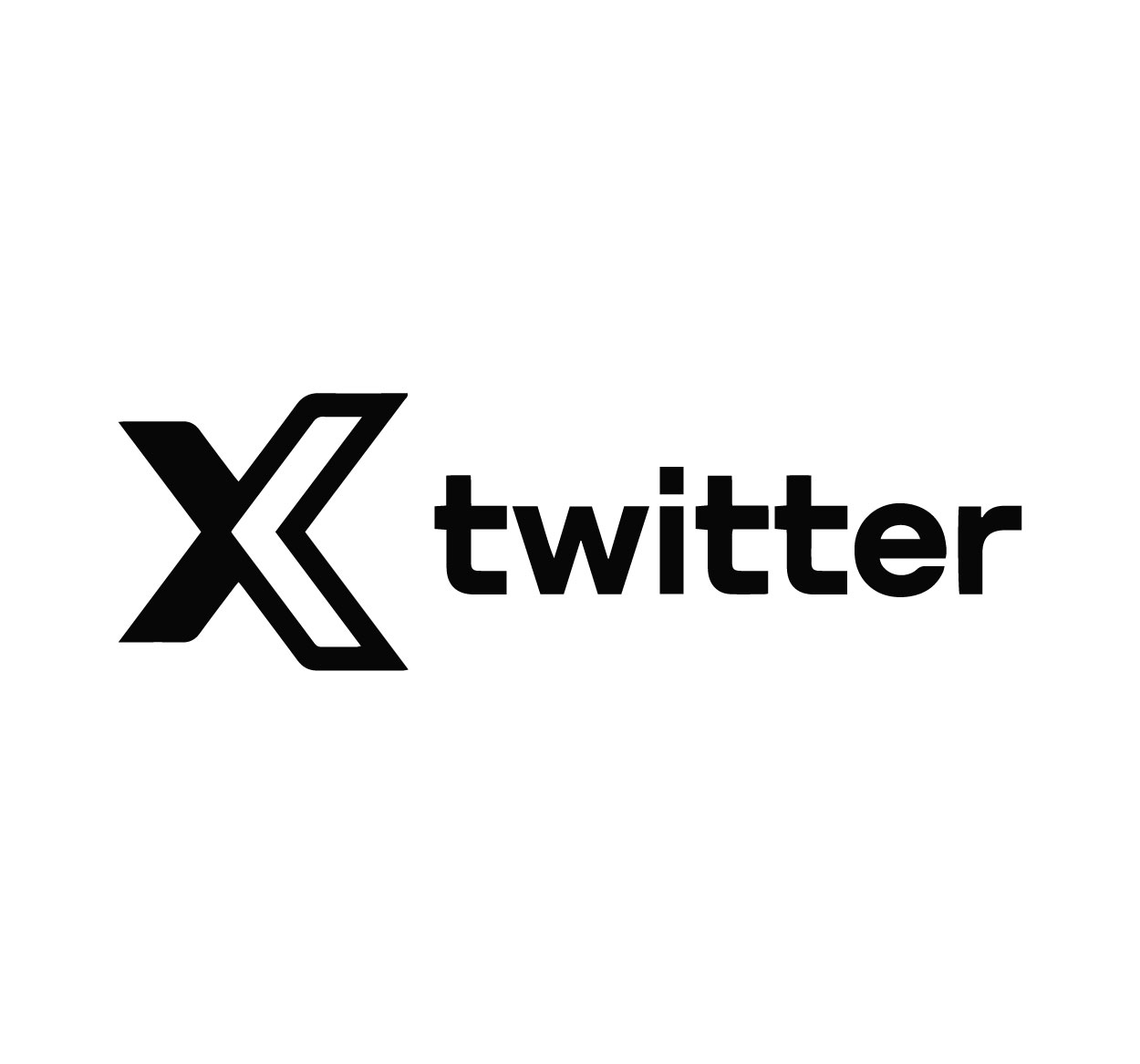
In 2023, under Elon Musk’s leadership, Twitter underwent a radical rebranding, with the platform adopting the name "X" and the iconic blue bird logo being replaced by the "X" symbol. This rebranding was part of Musk’s vision to transform Twitter into a broader “everything app,” similar to platforms like WeChat in China. The new logo features a minimalist, geometric X, designed to evoke a sense of simplicity and modernity.
This rebranding, however, was met with mixed reactions. While some saw it as a bold new direction for the platform, others were reluctant to part with the familiar blue bird. Despite the criticism, the Twitter X logo became the cornerstone of the platform’s new identity, signaling a shift towards Musk’s vision of a multifunctional social platform.
The X logo not only marks a visual change but also reflects Twitter’s transformation into a platform that would expand beyond social media to include banking, messaging, and other digital services.
2. Design Elements of the Twitter X Logo
The design of the Twitter X logo is sleek and modern, symbolizing a fresh start for the platform. Here’s a breakdown of its key elements:
Simple Geometry:
The logo consists of a bold, angular “X” that conveys strength and stability. The use of sharp lines and a symmetrical design makes the logo easily recognizable and scalable across different platforms.
Color Palette:
The X logo typically features a black or white color scheme, emphasizing its minimalist aesthetic. This choice reflects the modern, digital nature of the platform and contrasts with Twitter’s traditional blue color, signifying a departure from its roots.
Minimalism:
The lack of additional graphic elements or embellishments in the X logo is a reflection of current design trends in tech branding. By adopting a simple and clean design, the X logo communicates efficiency and a focus on user experience.
These design choices were made to help Twitter X stand out in an increasingly crowded social media space and communicate its new, ambitious mission.
3. What the Twitter X Logo Represents
The Twitter X logo is more than just a rebranding effort—it represents the evolution of the platform and its vision for the future. The shift from Twitter to X signifies several key changes:
A New Era for Social Media:
By rebranding Twitter as X, Elon Musk aims to expand the platform’s capabilities beyond traditional social networking. The X logo reflects this ambition, hinting at a future where the platform serves as an all-in-one service for communication, finance, and beyond.
Innovation and Disruption:
The boldness of the X logo reflects Musk’s desire to disrupt the status quo. The new logo is part of a broader strategy to challenge other tech giants by creating a more comprehensive digital ecosystem.
Emphasizing Modernity and Simplicity:
The minimalist design of the X logo aligns with modern branding trends that focus on simplicity and ease of recognition. This approach also speaks to Musk’s focus on creating a streamlined, user-friendly experience.
The Twitter X logo is a visual representation of a platform that’s no longer just a microblogging site—it’s a cornerstone of Musk’s vision for a more interconnected digital world.
4. How the Twitter X Logo Compares to Other Tech Brands
The rebranding of Twitter into X places it in competition with other tech giants like Google, Facebook, and Apple, all of which have iconic, minimalist logos. Here’s how the Twitter X logo compares:
Minimalism in Modern Tech Branding:
Like Apple’s clean and simple Apple logo or Google’s use of basic shapes and colors, the Twitter X logo embraces minimalism. This modern design philosophy reflects the growing trend in tech logos to use simple shapes for better brand recognition and adaptability.
Differentiating from Competitors:
The X logo differentiates Twitter from competitors like Facebook and Instagram, whose logos rely on more recognizable visual cues (the thumbs-up or camera icon). By adopting a unique symbol, the X logo sets the brand apart and positions it as an innovator in the digital space.
Future-Proofing the Brand:
Just like how the Apple logo has remained relatively unchanged over the years, the X logo’s simplicity ensures it will be versatile and scalable across various formats, from websites to apps to physical merchandise.
The Twitter X logo’s design aligns with a broader trend in tech branding, embracing a timeless yet modern aesthetic that’s primed for future growth.
5. How to Download the Twitter X Logo
If you’re looking to use the Twitter X logo for your projects, you can download the high-quality PNG version of the logo for personal or commercial use. Here’s how to find it:
Official Sources:
Always make sure to download logos from official sources to ensure you’re using the most up-to-date and authorized versions. Visit the official Twitter X website or media kit page, where you can find logo assets for download.
Logo Use Guidelines:
Before using the Twitter X logo, make sure to check the platform’s brand guidelines. These guidelines provide instructions on how to use the logo correctly, including restrictions on modifying or altering the design.
By following these steps, you can easily access and use the official Twitter X logo for your creative needs while adhering to the brand’s guidelines.