The Starbucks logo is one of the most recognizable symbols in the world, instantly associated with the popular coffee brand. But what does the Starbucks logo actually represent? This iconic logo has evolved over the years, shifting in design while still keeping the essence of its origin intact. With its captivating imagery of a siren, the logo represents themes of adventure, mystery, and the art of coffee. In this article, we’ll explore the evolution of the Starbucks logo, its hidden meanings, and how it plays a role in building the brand's global identity. For more insights into branding and logo design, visit SeekVectors.
1. The Origins of the Starbucks Logo
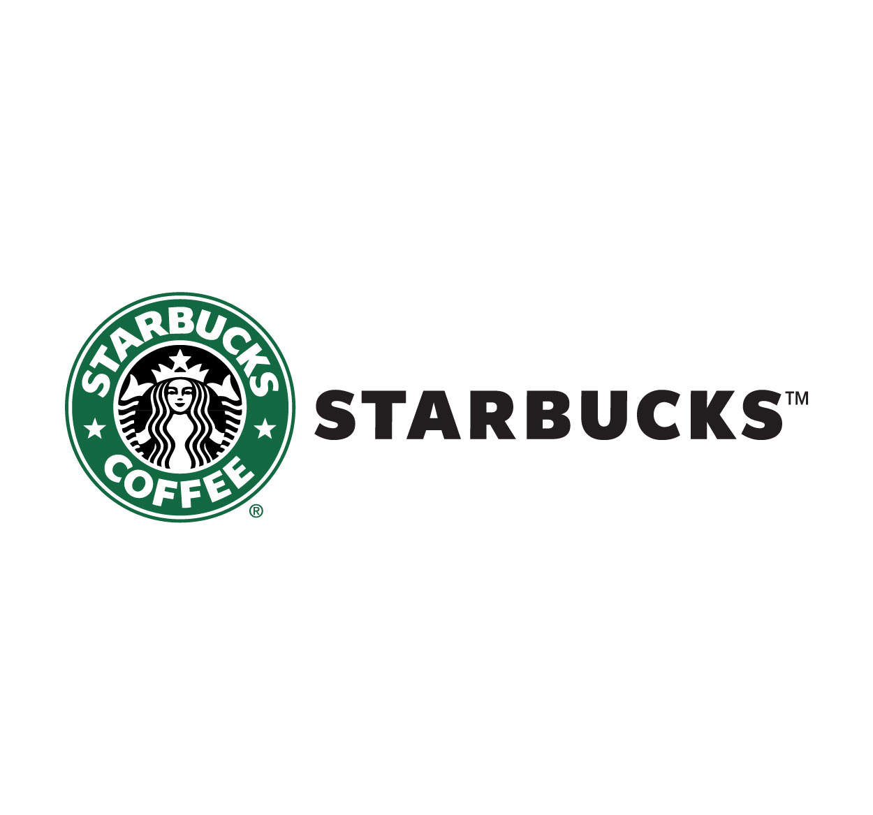
Starbucks was founded in 1971 in Seattle, Washington, and its original logo featured a twin-tailed mermaid, also known as a siren, which is a symbol of maritime tradition. This design was inspired by the city’s coastal location, and the idea was to evoke the feeling of adventure and discovery—qualities that align with the coffee-drinking experience.
The original logo was highly detailed, showing the siren in full, with a crown and flowing hair. It was an illustration that captured the essence of the sea, invoking the allure and mystery associated with maritime mythology.
Initial Design (1971):
The first Starbucks logo used brown tones, featuring a detailed image of the siren. This design was reflective of the earthy and organic nature of coffee.
Symbolism of the Siren:
The siren symbolizes the seductive, enchanting allure of coffee, enticing customers to explore the brand’s rich flavors and stories.
As Starbucks expanded, the logo evolved to maintain relevance while keeping the core elements intact.
2. The Evolution of the Starbucks Logo
Over the years, the Starbucks logo underwent several changes. Each redesign was aimed at simplifying the design and making it more modern, while still staying true to its original symbolism. Here's a breakdown of the logo's evolution:
The 1987 Redesign:
In 1987, Starbucks went through a major rebranding, and the logo was simplified. The company dropped the brown color in favor of green, which symbolized the freshness, vibrancy, and growth that the company was experiencing. The siren’s full body was cropped, with only her face and upper body remaining. This version was more streamlined and modern, catering to the urban appeal of the coffeehouse.
The 1992 Redesign:
In 1992, the logo was further simplified, with the green background becoming more prominent. The siren’s face became more visible, with fewer details, giving the logo a cleaner, more contemporary look.
The 2011 Redesign:
The most recent redesign of the Starbucks logo took place in 2011, when the company removed the company name from the logo entirely. The siren, now surrounded by a green circle, became the central figure. This simplified logo focused entirely on the siren as the brand's identity, symbolizing the evolution of Starbucks from a coffee shop to a global lifestyle brand.
3. The Meaning Behind the Starbucks Logo
The Starbucks logo is more than just a symbol; it represents the core values and identity of the brand. Here are some key elements of the logo’s meaning:
The Siren (Twin-Tailed Mermaid):
The siren in the logo represents the allure of coffee and the journey of discovery. According to Greek mythology, sirens would lure sailors into the sea with their enchanting songs. In the context of Starbucks, the siren symbolizes the irresistible pull of the brand, which draws customers to their stores for coffee and community.
Green Color:
The green color used in the logo has multiple meanings. It represents growth, freshness, and sustainability—values that Starbucks embraces in its business practices. Green also evokes a sense of tranquility, making it a perfect fit for the brand’s coffeehouse ambiance.
Evolution of the Logo:
The removal of the text from the logo in 2011 signified Starbucks’ transition from a local coffee shop to a global brand with recognition independent of words. It also symbolized the company’s confidence in its identity.
Through its logo, Starbucks tells a story of journey, passion, and connection with nature, establishing a strong emotional bond with customers around the world.
4. The Role of the Starbucks Logo in Branding
The Starbucks logo plays a pivotal role in the brand’s overall strategy. It is a visual representation of the company’s values, its products, and its connection to its customers. Here's how the logo works in branding:
Brand Recognition:
The Starbucks logo is one of the most recognized logos globally. Its simple yet effective design ensures that customers can identify the brand instantly, whether on a coffee cup, a storefront, or an advertisement. The green and white color scheme is universally associated with Starbucks.
Emotional Connection:
The logo evokes a sense of warmth, comfort, and community. Starbucks has built its brand around the idea of a “third place” where people can gather, relax, and enjoy a cup of coffee. The siren symbolizes the welcoming nature of Starbucks, making it a place customers feel connected to, both personally and socially.
A Symbol of Quality:
The consistent use of the logo across all Starbucks stores worldwide signifies a commitment to quality and consistency. Customers know that when they see the logo, they can expect the same high-quality products and service, regardless of location.