Known for its flat-pack furniture and self-service shopping experience, IKEA is a global leader in home furnishings. Founded in 1943 by the Swedish entrepreneur Ingvar Kamprad, IKEA's philosophy revolves around affordability, functionality, and design for the many. From its humble beginnings selling pens and lighters, IKEA has revolutionized the furniture industry with its focus on cost-efficiency and self-assembly furniture.
By downloading ikea logo black and white you agree with intellectual property rights in our Privacy Policy.
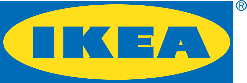
IKEA, the world's renowned furniture retailer, is easily recognizable by its iconic blue and yellow logo. But this seemingly simple design has a rich history, evolving alongside the company itself. The logo's journey offers a glimpse into the vision of IKEA's founder, Ingvar Kamprad, and the brand's core values.
In the early days, IKEA's logo was quite different. Drafted in 1947, it featured a cloud-like image, possibly symbolizing a sense of establishment. This logo reflected the company's initial focus on selling furniture and homeware products.
The 1960s marked a turning point for IKEA's logo design. Enter Gillis Nilsson, a professional designer tasked with streamlining and standardizing the logo. Nilsson's keen eye brought significant changes. The accent above the "E" was removed, and the font was redesigned for better readability. The diagonal line transformed into a horizontal one, and the company name was placed within an oval. This logo also included variations of "Möbel" (furniture) and "Älmhult" (IKEA's founding town), reflecting the brand's Swedish roots.
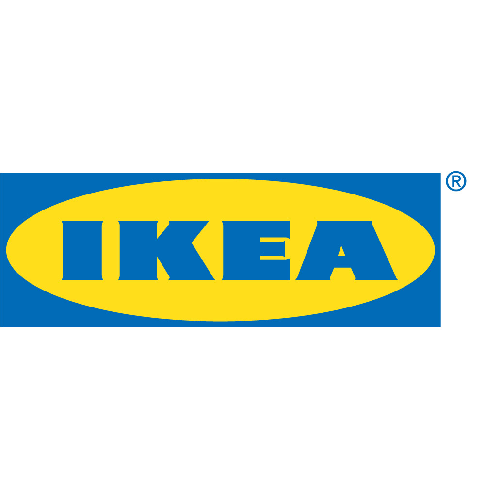
By the mid-1960s, IKEA was ready to take on a more international presence. The now-familiar blue and yellow color scheme was introduced, with the logo appearing in a rectangular frame. This black and white design with the blue and yellow text ensured clarity and legibility across different cultures. The logo we recognize today, minus the location details, emerged during this period.
The IKEA logo's simplicity and use of primary colors are not accidental. They represent the brand's commitment to affordability, accessibility, and functionality. The blue color evokes a sense of trust and stability, while the yellow signifies optimism and joy – qualities IKEA associates with creating a better everyday life at home.
While the core design of the IKEA logo has remained consistent for decades, subtle refinements have been made over time. In 2019, the logo underwent a minor redesign, with slight adjustments to the letterforms for a more modern feel. This demonstrates IKEA's ability to adapt while staying true to its core identity.
The IKEA logo stands as a testament to the company's remarkable journey. From its humble beginnings under Ingvar Kamprad's vision to its global presence today, the logo's evolution reflects IKEA's dedication to providing accessible and well-designed furniture for everyone.


