The Logo Heineken stands as a symbol of timeless branding in the beer industry, embodying this renowned brewery's heritage and global presence. With its distinctive green bottle and red star, Heineken's logo is instantly recognizable across continents, representing a blend of tradition and innovation. This iconic design has evolved, adapting to contemporary tastes while maintaining its core identity. Delving into the history and evolution of the Heineken branding, we uncover the strategic decisions that have cemented its place as a global leader. From its humble beginnings to its current status, the Logo Heineken exemplifies how a well-crafted logo can contribute significantly to a brand's enduring success.
By downloading logo heineken you agree with intellectual property rights in our Privacy Policy.
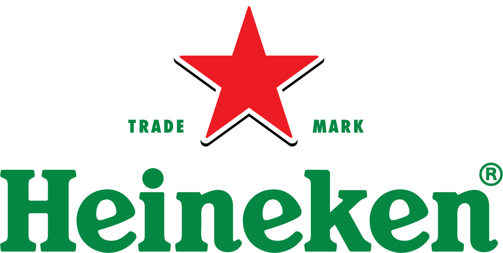
The Logo Heineken is not just a symbol; it represents the brand's rich history and heritage in the brewing industry. Established in 1864 by Gerard Adriaan Heineken, the company has grown from a small brewery in Amsterdam to one of the largest and most recognized beer brands worldwide. The journey of the logo reflects the company's evolution from a straightforward typeface to the distinctive emblem we see today. The red star, a vital feature of the Heineken branding, has been present since the early 20th century, symbolizing the quality and excellence of Heineken beer. Over the years, the logo has undergone several modifications, yet it has consistently retained its core elements, ensuring brand consistency and recognition.
The design of the Logo Heineken is a masterclass in simplicity and effectiveness. The logo features a green color palette, which stands out on store shelves and aligns with the brand's commitment to sustainability and quality. The red star, often the focal point of the design, is a historical element that dates back to the medieval brewers who believed it had mystical powers to ward off evil spirits. The elegant and friendly typeface used in the logo conveys approachability and modernity, appealing to a broad audience. This combination of color,symbols, and typography has made the Heineken branding instantly recognizable and memorable worldwide.
Every element of the Heineken logo has been carefully chosen to represent the brand's values and identity. The green color is not just for aesthetic appeal; it symbolizes freshness, nature, and quality, which are critical attributes of Heineken beer. The red star, an iconic part of the logo, initially served as a symbol of excellence. It also connects with the five brewing ingredients: water, barley, hops, yeast, and the 'magic' ingredient, which is the passion of the brewers. The clean and modern typeface reflects the brand's innovation and global reach. This thoughtful combination of elements has helped maintain the Heineken logo as a powerful symbol in the beer industry.
The Logo Heineken has achieved global recognition, becoming synonymous with quality beer and enjoyable experiences. As the brand expanded into international markets, the logo became familiar in pubs, bars, and stores worldwide. The logo's simple yet impactful design plays a crucial role in maintaining this recognition. It is a beacon for consumers seeking a consistent and quality beer experience. The success of the Heineken branding strategy is evident in how well the logo communicates the brand's values and connects with its audience, making it one of the most iconic beer logos globally.
Marketing has been a significant factor in the widespread recognition of the Logo Heineken. Since its early days, Heineken has utilized the logo in advertising campaigns to emphasize the brand's premium quality and unique taste. The logo has appeared in various media, from print advertisements to digital platforms, ensuring consistent brand presence. Heineken's marketing strategy often leverages the logo's recognizable elements, such as the red star and green color, to create compelling visuals that attract attention and evoke brand loyalty. This strategic use of the Heineken branding in marketing has reinforced the logo's association with quality and reliability.
As Heineken continues to innovate and expand, the Logo Heineken remains a vital part of its identity. While the core elements of the logo are likely to remain unchanged, reflecting the brand's rich heritage, there may be subtle updates to keep the design fresh and relevant. The future of the logo will also likely see more integration with digital platforms, enhancing interactive and immersive consumer experiences. In an era where branding plays a crucial role in consumer choices, the Heineken branding strategy, centered around its iconic logo, will continue to be a key asset in maintaining and expanding its global market presence.
The Logo Heineken is more than just a visual identifier; it symbolizes quality, tradition, and global reach. Its design elements and the thoughtful symbolism behind them have made it one of the most recognizable logos in the world. As Heineken moves forward, the logo will play a pivotal role in the brand's identity and marketing efforts. Whether you're a fan of beer or a student of branding, the story of the Heineken logo offers valuable insights into the power of practical design and strategic branding.
What does the red star in the Heineken logo represent?
The red star in the Logo Heineken symbolizes excellence and tradition. It is also associated with the five brewing ingredients and has historical significance in the brewing industry.
Why is the Heineken logo green?
The green color in the Logo Heineken represents freshness, quality, and the brand's commitment to sustainability. It also helps the logo stand out on shelves.
Has the Heineken logo changed over the years?
Yes, the Heineken logo has evolved, with changes mainly in typography and design details, but it has consistently retained its core elements, like the green color and red star.
What makes the Heineken logo iconic?
The simplicity, consistency, and effective use of color and symbolism make the Logo Heineken iconic. Its global recognition is a testament to its successful design.
Is the Heineken logo the same worldwide?
Yes, the Logo Heineken remains consistent globally, helping to maintain brand identity and recognition across different markets.
How does the Heineken logo contribute to its marketing?
The Heineken logo is central to the brand's marketing strategy. It serves as a visual cue for quality and reliability and is used extensively in advertising and promotional materials.


