
By downloading Starbucks Coffee Logo meaning you agree with intellectual property rights in our Privacy Policy.
Have you ever wondered about the story behind the iconic Starbucks Coffee logo? Beyond its familiar green and white design lies a rich tapestry of symbolism and history. Join us as we unravel the mysteries behind the Starbucks Coffee logo and explore its deeper meanings.
Starbucks, a global coffeehouse giant, wasn't always the behemoth we know today. The company's humble beginnings in Seattle in 1971 are reflected in its original brown logo, featuring a twin-tailed siren encircled by its name. Over the years, the logo underwent several transformations, eventually evolving into the recognizable green and white emblem we see today.
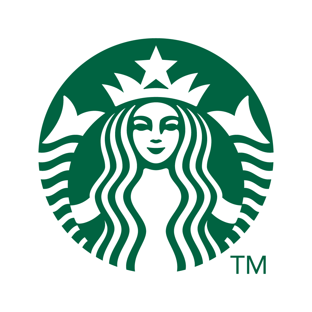
The enigmatic siren, a mythical creature with two tails, flowing hair, and a crown, is central to the Starbucks Coffee logo. This captivating figure has roots in maritime history, representing seduction and allure. Starbucks founders chose the siren as a symbol of the allure and quality of their coffee, inviting customers into a world of sensory delight.
The distinctive green and white color scheme of the Starbucks logo isn't just visually appealing – it's intentional. Green, associated with growth, freshness, and nature, reflects the company's commitment to ethical sourcing and sustainability. This choice resonates with environmentally conscious consumers, aligning Starbucks with values beyond exceptional coffee.
As Starbucks expanded globally, the logo continued to adapt. In 2011, the company unveiled a streamlined version, shedding the outer ring and focusing on the siren herself. This change aimed to create a more contemporary and streamlined look, emphasizing Starbucks' commitment to innovation and staying relevant in an ever-evolving market.
The Starbucks Coffee logo isn't just a symbol; it's a narrative that tells the tale of a company's journey from a single store in Seattle to a global coffeehouse phenomenon. With her maritime charm, the siren invites coffee lovers to experience the magic within each cup. As you sip your favorite Starbucks brew, take a moment to appreciate the thought and symbolism behind the iconic logo – a visual representation of quality, sustainability, and the love for exceptional coffee.


