Favicon Sizes: The Complete Guide
Filed under Design
A favicon has to survive two very different jobs. At 16 pixels it sits in a browser tab next to a dozen others, where it is barely more than a coloured shape. At 512 pixels it becomes an app icon on a phone home screen, where every edge is visible. One image cannot do both well, which is why a modern site ships a set rather than a single file.
This guide covers which sizes actually matter in 2026, what each one is for, and the markup that ties them together. If you would rather skip the theory, the favicon generator produces the whole set from any logo in your browser.
The sizes that still matter
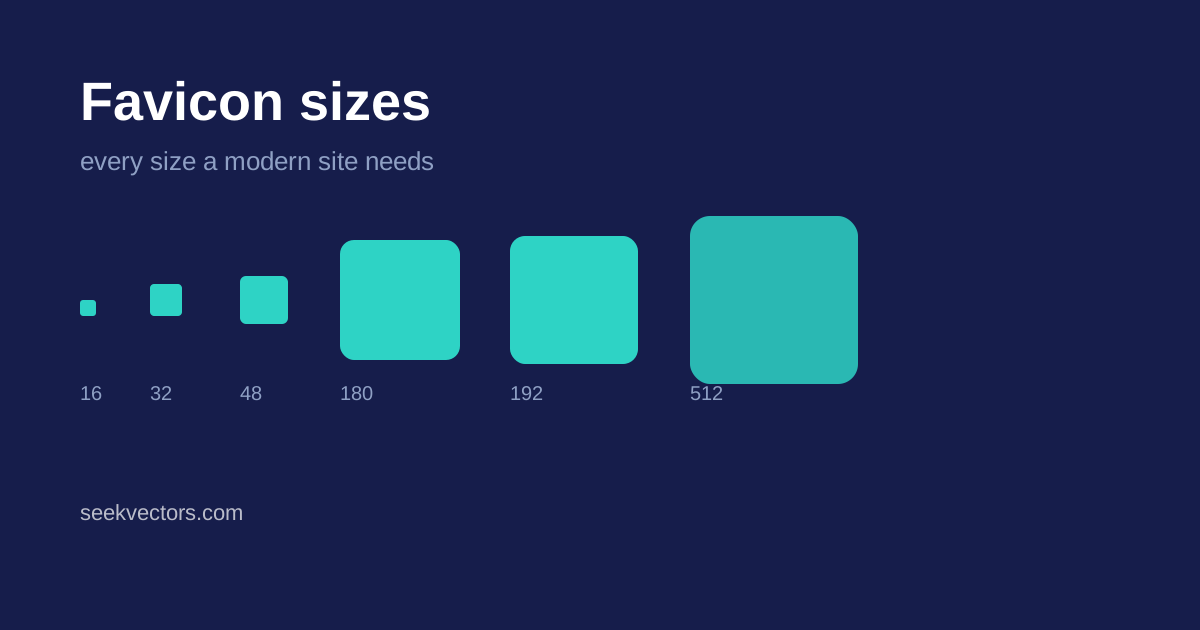
Over the years browsers have asked for a long list of icon sizes. Most of that list is now obsolete. These are the ones worth generating:
- 16 × 16 — the browser tab and the bookmarks bar. This is the size your logo has to survive as a handful of pixels, and it is the one people actually see most often.
- 32 × 32 — high-density tabs, the Windows taskbar, and Safari's bookmark list. If you only generate two sizes, make them 16 and 32.
- 48 × 48 — Windows site shortcuts and some desktop contexts. Cheap to include, occasionally useful.
- 180 × 180 — the Apple touch icon, used when someone adds your site to an iOS home screen. iOS does not read your web manifest for this, so it needs its own link tag.
- 192 × 192 — the Android home screen icon, referenced from the web app manifest.
- 512 × 512 — the large manifest icon, used for splash screens and app listings.
Do you still need favicon.ico?
Yes, though not for the reason people assume. Modern browsers prefer the PNG links in your HTML. But a range of other clients — feed readers, link previewers, older browsers, some crawlers — request /favicon.ico directly from the site root without ever parsing your markup. If the file is not there, they get a 404 and fall back to a generic icon.
An .ico file is a container: it can hold several images at different sizes in one file. The conventional contents are the 16, 32 and 48 pixel versions. Serve it from the root of your domain, not from a subfolder.
The SVG favicon
Every current desktop browser supports an SVG favicon, and it has one property no raster icon has: it can respond to the user's colour scheme.
<link rel="icon" href="/favicon.svg" type="image/svg+xml">Inside that SVG you can include a media query so the mark inverts on a dark browser theme:
<style>
  path { fill: #161d4b; }
  @media (prefers-color-scheme: dark) { path { fill: #ffffff; } }
</style>
An SVG favicon does not replace the raster set — iOS and Android still want PNGs — but it makes the tab icon look deliberate in both themes. Most of the logos in our free SVG collection are simple enough to work at favicon scale without modification.
The markup
This is the complete, current set. Anything beyond it is legacy.
<link rel="icon" href="/favicon.ico" sizes="any">
<link rel="icon" href="/favicon.svg" type="image/svg+xml">
<link rel="icon" type="image/png" sizes="32x32" href="/favicon-32x32.png">
<link rel="icon" type="image/png" sizes="16x16" href="/favicon-16x16.png">
<link rel="apple-touch-icon" sizes="180x180" href="/favicon-180x180.png">
<link rel="manifest" href="/site.webmanifest">
And the manifest itself:
{
  "icons": [
    { "src": "/favicon-192x192.png", "sizes": "192x192", "type": "image/png" },
    { "src": "/favicon-512x512.png", "sizes": "512x512", "type": "image/png" }
  ]
}
Designing for 16 pixels
This is where most favicons fail. A logo that reads beautifully on a letterhead usually turns to mush in a tab. A few things that reliably help:
- Drop the wordmark. Text is unreadable below about 40 pixels. Use the symbol, the monogram, or a single letter.
- Simplify to one or two shapes. Fine detail disappears; what survives is silhouette and contrast.
- Leave a little padding. An icon that bleeds to the edge looks cramped next to icons that do not. Around 10% on each side is a reasonable default.
- Check it on both themes. A dark navy mark vanishes against a dark tab bar. If your logo is very dark or very light, consider a background shape.
- Test at actual size. Zooming a 16-pixel icon to inspect it tells you nothing. Load it in a real tab.
Generating the set
You can export each size by hand from a design tool, but it is repetitive and easy to get subtly wrong — a slightly different crop at one size is surprisingly visible. Our favicon generator takes any SVG, PNG or JPG, renders all six sizes and a multi-resolution .ico, and gives you the markup above ready to paste. It runs entirely in your browser, so nothing is uploaded anywhere.
If you are starting from a brand mark rather than your own artwork, you can pick any logo from the A–Z brand index and generate from that directly.
A quick checklist
- Six PNG sizes: 16, 32, 48, 180, 192, 512
- A multi-resolution
favicon.icoat the site root - An SVG favicon if your mark is simple enough
- A web manifest referencing the 192 and 512 icons
- Verified at real size, in both light and dark themes
Get those right once and you will not need to think about favicons again for years.