How to Find Any Brand's Exact Colours
Filed under Design
Matching a brand colour by eye never works. What looks like the same red on your screen is three shades off in the file, and the difference shows the moment it sits next to the real thing. If you need a brand's exact colours, you need the actual values — and there are only a few reliable ways to get them.
The three notations, and when each matters
The same colour can be written several ways. They describe the same thing; they differ in what they make easy.
- HEX —
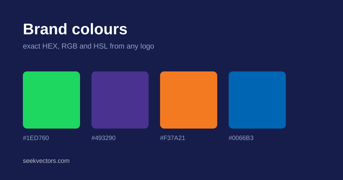
#1ED760. Six hexadecimal digits for red, green and blue. The default in web design and the format most brand guidelines quote. - RGB —
rgb(30, 215, 96). The same three channels as decimal numbers. Easier to manipulate in code, and the form you need when adding transparency withrgba(). - HSL —
hsl(141, 76%, 48%). Hue, saturation, lightness. Far more intuitive for making a colour lighter or more muted, because you change one number instead of guessing at three.
For print you will also meet CMYK and Pantone. Those cannot be derived reliably from a screen colour — ink behaves differently from light — so if you are producing print work, take them from the brand's guidelines rather than converting.
Where to get the real values
The brand's own guidelines are authoritative. Search the company name plus "brand guidelines" or "brand assets". If they publish a colour, use that number and stop looking.
The logo file is the next best source. An SVG is plain text: open it in any editor and the fills are written in it directly, usually as hex. This is exact, because you are reading the value the designer set rather than sampling a rendered image.
Sampling the rendered logo is the practical option when the file is a PNG or the SVG uses gradients. This is what our colour palette extractor does: it renders the logo, reads the pixels, groups near-identical shades, and returns the dominant colours as HEX, RGB and HSL. It runs in your browser, and you can start from any of the logos in the library.
Why sampling needs to be smarter than a colour picker
Clicking a pixel with an eyedropper is unreliable for one specific reason: anti-aliasing. Wherever two colours meet, the renderer paints a run of intermediate pixels to smooth the edge. Click one of those and you get a blend, not a brand colour.
A good extractor handles this in two steps. It groups colours that are perceptually near-identical, so that a single brand green does not come back as eight marginally different greens. Then it discards colours that sit on the line between two more dominant ones, because those are almost always edge blends rather than real palette entries.
The difference is easy to see. Sampling a logo naively might return eight colours; done properly it returns the two or three the designer actually chose.
Contrast: the number people forget
A brand colour is not automatically usable as a text colour. The WCAG contrast ratio tells you whether text will be readable against a given background, on a scale from 1:1 to 21:1.
- 4.5:1 — the minimum for normal body text (level AA).
- 3:1 — acceptable for large text, roughly 24px or 19px bold.
- 7:1 — level AAA, worth aiming for on long-form reading.
Plenty of well-known brand colours fail against white. A mid-tone green might land around 1.9:1 on white — fine as a background with white text on it, unreadable as body text. Our extractor reports the ratio against both white and black for every colour it finds, so you can see immediately which way round to use it.
Building a usable palette from a logo
Two or three brand colours are rarely enough for a real interface. A workable approach:
- Take the dominant colour as your primary.
- Derive tints and shades by changing only the lightness in HSL. This keeps the hue consistent, which eyeballing does not.
- Pick a neutral grey that shares a little of the primary's hue rather than a pure grey — it makes the whole palette feel deliberate.
- Reserve the secondary brand colour for accents and calls to action, not large areas.
- Check every text-on-background pair for contrast before you commit.
A note on colour and ownership
Colour values themselves are not protected — a hex code is a number, and you cannot own a number. What can be protected is the use of a colour as a brand identifier in a particular market, which a handful of companies have secured for very specific applications.
In practice this means you can freely note that a brand uses a particular green, and use that green in a comparison chart or an article. Building your own competing product around a rival's exact brand colour is a different question. The same principles in our guide to using brand logos legally apply.