Buick, a division of General Motors, holds a prominent position in the automotive industry, renowned for its legacy of producing luxurious and reliable vehicles. Established in 1908, Buick has consistently delivered a refined driving experience, catering to discerning customers who seek a blend of comfort, performance, and style. From its iconic LeSabre model to its modern Enclave SUV, Buick's vehicles embody the brand's commitment to innovation and elegance.
By downloading buick logo png you agree with intellectual property rights in our Privacy Policy.
The Buick logo is a timeless emblem instantly recognized by car enthusiasts worldwide. But its journey to becoming a symbol of sophistication is a fascinating story filled with evolution and meaning.
The Buick Motor Company, founded in 1903, saw its first logo featuring a patriotic Uncle Sam standing on a globe. This short-lived design was quickly replaced by variations incorporating the Buick name.
However, the seeds of the iconic tri-shield were sown in 1913 with the introduction of a logo featuring a square frame and the Buick name diagonally placed on top. This design subtly referenced the Buick family's Scottish heritage, a theme that would become central to the brand's identity.
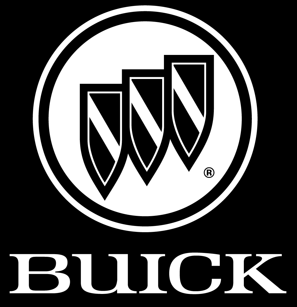
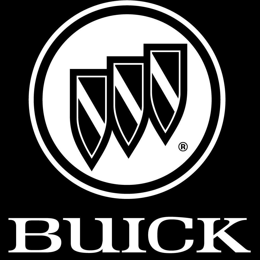
In 1960, the now-famous tri-shield logo debuted. This design was a nod to Buick's expanding lineup, with each shield representing the Electra, LeSabre, and Invicta models. The tri-shield remained a constant presence for decades, undergoing refinements in detail and color. Notably, the checkered patterns within the shields gave way to clean, diagonal lines in the 1980s, reflecting a shift towards a more modern aesthetic.
An exciting detour in Buick's logo history occurred in the mid-1970s. The introduction of the Buick Skyhawk saw the tri-shield joined by a hawk emblem—this avian motif aimed to symbolize power and freedom, aligning with the Skyhawk's sporty character. However, the hawk design was discontinued in 1980, with the tri-shield reclaiming its rightful place.
The current Buick logo, introduced in 2016, represents the culmination of a rich heritage. The three shields are rendered in different shades of silver, signifying refinement and innovation. The black background adds a touch of sophistication, while the surrounding chrome circle further elevates the brand's image.
Whether you're searching for a high-resolution PNG of the Buick logo for a project or simply curious about its history, understanding the symbolism and evolution of this emblem offers a deeper appreciation for the Buick brand's enduring legacy.


