Disney Channel has become a household name synonymous with quality programming for young audiences. Launched in 1983, the channel has captivated viewers with a vibrant mix of original television series, theatrically-released and made-for tv movies, and select acquired shows.
"🌟🎬 Magic awaits with the Disney Channel Logo! ✨📺"

By downloading Disney Channel Logo you agree with intellectual property rights in our Privacy Policy.
The Disney Channel logo is more than just a picture on your TV screen - it's a symbol of childhood memories, magical programming, and a gateway to fantastical worlds. But this iconic logo hasn't always looked the way it does today. Over the years, the Disney Channel logo has undergone several transformations, reflecting the changing nature of the channel itself.
In 1983, when the Disney Channel first launched, its logo was a simple yet charming design. Imagine a classic television screen with a delightful blue striped pattern and a silhouette of Mickey Mouse, the beloved mascot, right in the center. This logo stayed true to the Disney brand, emphasizing both the channel's television format and its connection to the magical world of Disney.
The late 90s saw a shift in the Disney Channel logo. The television screen transformed, adopting a sleek black design with rounded edges that resembled Mickey Mouse ears. Interestingly, Mickey himself took a temporary leave of absence from the logo itself for a brief period during this time. However, the purple color scheme added a touch of whimsy and youthfulness.
This period marked a turning point for the Disney Channel logo. In 2002, a major rebranding introduced a now-iconic era. The logo itself became a bit more abstract, featuring a stylized, three-dimensional castle silhouette. But the real magic came with the introduction of the "Wand ID" bumpers. These short clips featured Disney Channel stars using a wand to draw the logo on the screen, creating a personal connection with viewers and solidifying the logo's association with the channel's programming.
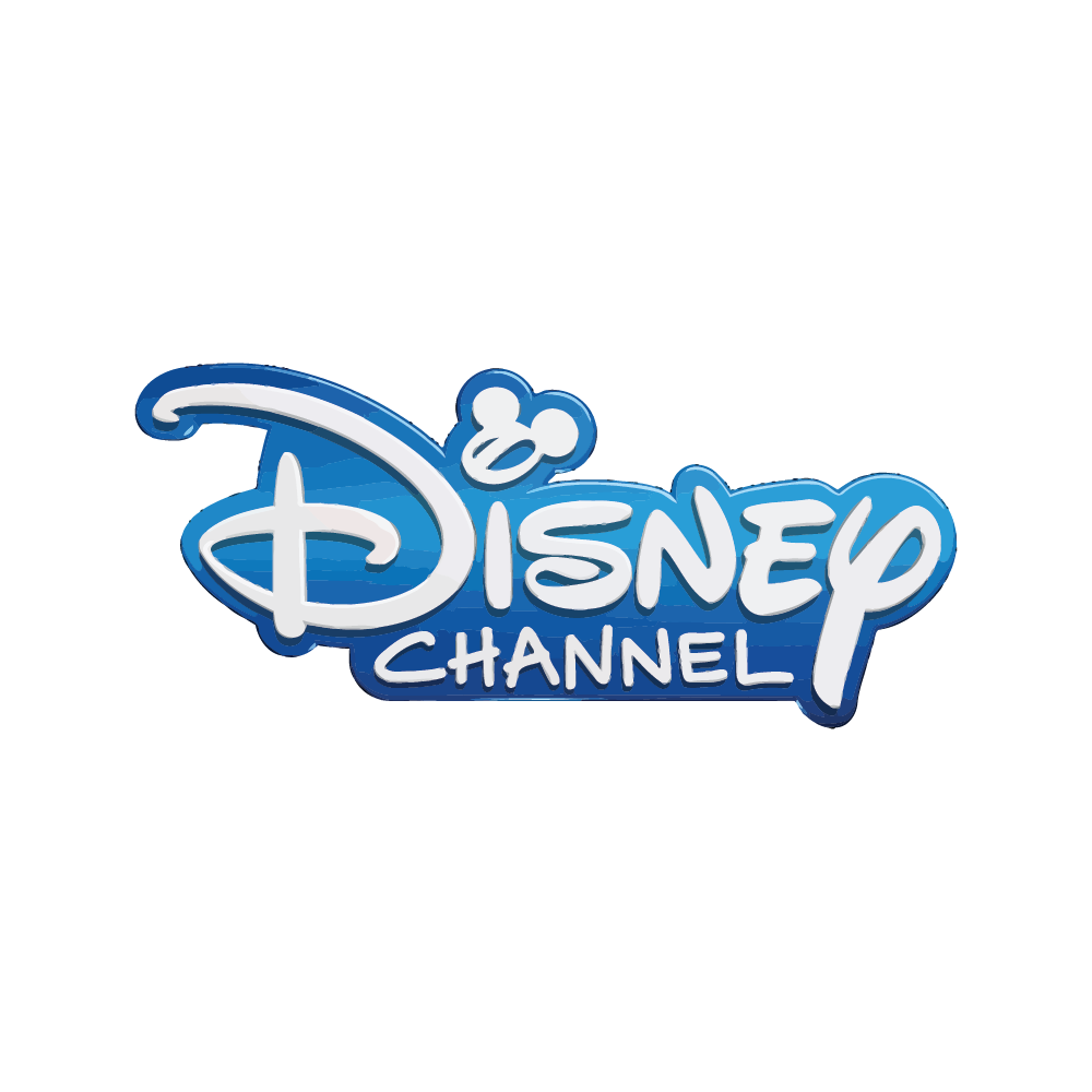
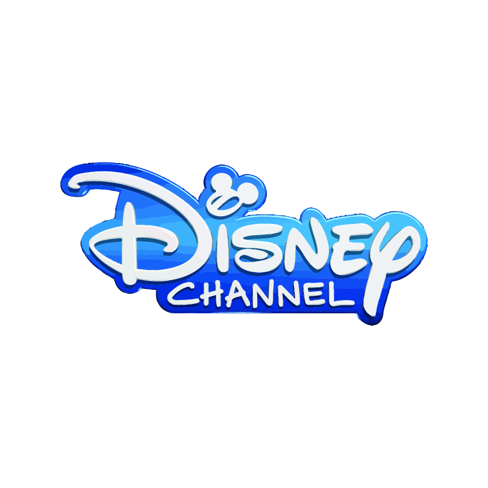
The current Disney Channel logo is a sleek and modern wordmark. The iconic blue and white color scheme remains, but the words "Disney Channel" are written in a bold, three-dimensional font. While Mickey Mouse is no longer directly incorporated, his legacy lives on in the brand's overall identity.
The Disney Channel logo's journey is a fascinating reflection of the channel's evolution. From its humble beginnings to its current form, it has consistently served as a beacon for generations of children, reminding them of the joy and wonder that Disney brings to their lives.


