Esquire magazine has cultivated a sophisticated reputation for over eight decades. Founded in 1933, it boasts a rich history of groundbreaking content, from pioneering fashion advice to tackling unconventional social issues. Published by Hearst Communications, Esquire offers a unique blend of intelligent commentary, insightful interviews, and captivating narratives, all crafted to engage and inspire the modern man.
"📰✨ Elevate your style with the iconic Esquire Magazine logo! 👔🌟"

By downloading Esquire Magazine Logo you agree with intellectual property rights in our Privacy Policy.
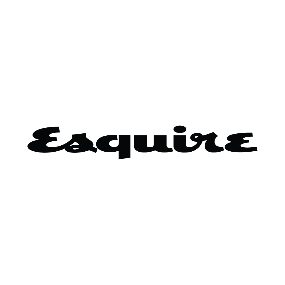
Esquire magazine has been a staple for men's fashion, culture, and politics for over 80 years. But beyond the sharp writing and iconic covers, there's another element that has stood the test of time: the Esquire logo.
This article delves into the history and evolution of the Esquire logo, exploring how it has reflected the magazine's changing style and target audience.
The first iteration of the Esquire logo, introduced in 1933, was a bold, all-caps serif typeface. This classic design exuded a sense of sophistication and authority, setting the tone for the magazine's content.
Perhaps the most recognizable element associated with the Esquire logo is "Esky," a cartoon character with a prominent mustache and a mischievous grin. Debuting alongside the initial logo, Esky graced nearly every Esquire cover for over four decades. This playful addition offered a counterpoint to the seriousness of the magazine's content, creating a sense of whimsy and lightheartedness.
In 1978, Esquire underwent a significant redesign, including its logo. The iconic Esky was retired, and the typeface was modernized to a cleaner, sans-serif font. This shift reflected a more contemporary and streamlined aesthetic, keeping pace with the evolving design trends.
The Esquire logo's journey is a testament to the power of a well-designed brand identity. It has remained adaptable while retaining its core essence, reflecting the magazine's evolution without losing its heritage. The logo continues to be a recognizable symbol of quality journalism and sophisticated style.


