General Electric (GE) has been a titan of innovation for over a century. This American conglomerate isn't just about appliances and engines, though. GE dives deep into renewable energy, healthcare, and cutting-edge technologies, constantly pushing the boundaries of what's possible. Buckle up, as we explore the multifaceted world of GE and its relentless pursuit of building a brighter future.

By downloading General Electric GE Logo you agree with intellectual property rights in our Privacy Policy.
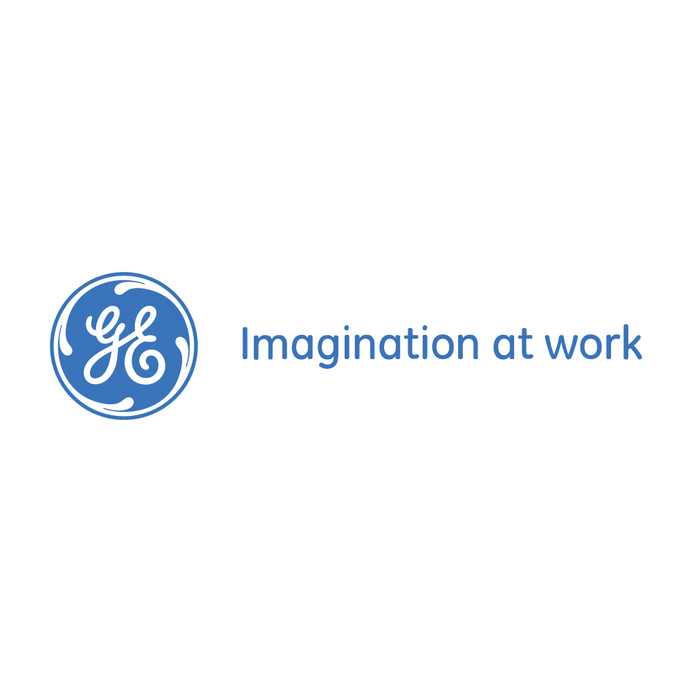
The General Electric (GE) logo, with its distinctive blue circle and interwoven initials "GE," is a recognized symbol of innovation and progress across the globe. This iconic logo's history reflects the company's own rich journey, from its humble beginnings in Schenectady, New York, to its current status as a leader in diverse technological fields.
Founded in 1892 by combining the forces of Thomas Edison's Edison General Electric Company and Thomson-Houston Electric Company, GE quickly established itself as a pioneer in the electrical industry. The original logo reflected this focus, featuring a light bulb design. However, as GE diversified into areas like aviation, healthcare, and appliances, the need for a more versatile symbol arose.
In 1956, the now-iconic blue circle and "GE" initials were introduced. Designed by Lippincott & Margulies, the logo conveyed a sense of modernity and dynamism. The blue color evokes trust and stability, while the circular shape symbolizes the company's global reach. The intertwined "GE" initials are a subtle nod to the company's heritage and the collaborative spirit that has driven its success.
The GE logo has undergone subtle refinements over the years, but its core design elements have remained. This consistency reflects the company's commitment to its core values of innovation and reliability. In 2020, as GE underwent a major restructuring, the logo remained a symbol of the company's enduring legacy, even as it transitioned into three separate entities: GE Healthcare, GE Vernova (energy), and GE Aviation.
Today, the GE logo continues to be a powerful symbol of American ingenuity. It is a reminder of the company's rich history and its ongoing commitment to shaping the future. From the humble beginnings in Schenectady to its current status as a leader in diverse technological fields, the GE logo stands as a testament to the enduring power of innovation.


