Striking a Chord: How to Design a Harmony Logo
The concept of harmony is universal. It evokes feelings of balance, unity, and a pleasing arrangement. When designing a logo for a brand named Harmony, capturing this essence visually becomes paramount.
What Makes a Harmony Logo Effective?
An effective Harmony logo should translate the concept of harmony into a memorable and impactful design. Here are some key elements to consider:
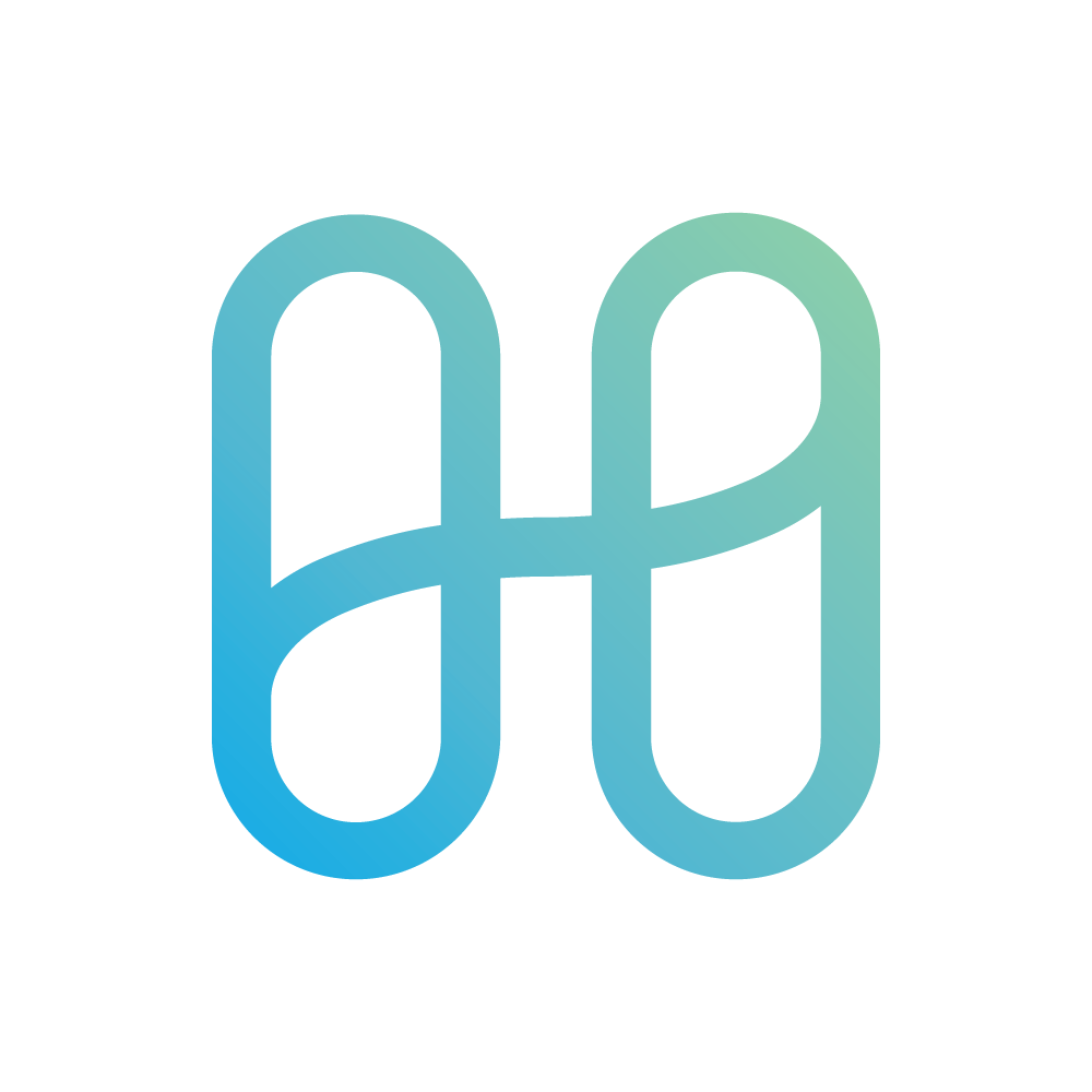
- Symbolism: Consider symbols that represent unity, balance, or connection. Circles, interlocking shapes, musical notes, or even natural elements like flowers or waves can all be effective.
- Color: Colors play a significant role in conveying emotions. Opt for calming and balanced color palettes like blues, greens, and purples. Brighter colors can work too, but ensure they complement each other harmoniously.
- Typography: Choose a font that is easy to read and conveys a sense of professionalism or approachability, depending on the brand's personality. Consider using a balance of upper and lowercase letters, or explore stylistic fonts that evoke a sense of togetherness.
Harmony Logo Design Inspiration
There are many directions you can take when designing a Harmony logo. Here are a few examples to spark your creativity:
- Abstract shapes: Overlapping circles or squares can represent unity and cohesion.
- Natural elements: A blossoming flower or a flowing river symbolize organic harmony.
- Musical notes: For a brand with a musical connection, interlocking musical notes can be a powerful choice.
- People or figures: Silhouettes of people holding hands or working together can convey a sense of community and collaboration.
Beyond the Design: Maintaining Harmony
Once you've designed a logo that embodies harmony, remember to consider how it will be used across different platforms and applications. Ensure the logo is scalable and maintains its clarity and impact when reproduced in various sizes.
By following these tips and using your creativity, you can design a Harmony logo that resonates with your target audience and effectively communicates the brand's message of balance and unity.


-01.svg "Dogecoin & DOGE Logo")


-01.svg "Litecoin Logo Png")
-01.svg "Monero Coin & XMR Logo")


