
By downloading HTC Logo you agree with intellectual property rights in our Privacy Policy.
HTC, the Taiwanese consumer electronics company, has undergone a significant transformation over the years. This is reflected not only in their products but also in their logo design. Let's take a trip down memory lane and explore the evolution of the HTC logo, a symbol that embodies the company's journey.
The original HTC logo featured the company's full name written out in a bold, geometric font. The "H" and "T" were slightly thicker than the "C," creating a sense of stability and strength. This logo clearly communicated the brand identity and served HTC well during their early years as a manufacturer of computers and PDAs.
As HTC began to focus more on smartphones, the logo went through a simplification. The designers removed the company's full name, leaving behind just the three letters "HTC." The letters remained bold but adopted a more rounded and streamlined appearance. This change reflected HTC's shift towards a more modern and mobile-centric brand image.
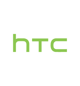
In 2015, HTC introduced its current logo. It's a minimalist design featuring just the three capitalized letters "HTC" in a clean, sans-serif font. The letters are thinner and more evenly spaced compared to the previous iteration. This logo conveys a sense of sophistication and simplicity, aligning with HTC's growing focus on virtual reality and enterprise solutions.
The evolution of the HTC logo is a fascinating study in how a company's visual identity can change alongside its strategic direction. From the bold, descriptive lettering of the early days to the minimalist elegance of today, the logo reflects HTC's continuous pursuit of innovation and adaptation in the ever-changing world of technology.
While the logo is a prominent symbol, it's important to remember that HTC's brand is built on more than just visuals. Their legacy of creating high-quality smartphones and pioneering virtual reality technology has solidified their place in the tech industry. As HTC continues to push boundaries and explore new frontiers, it will be interesting to see how their logo evolves alongside their future endeavors.


 Logo.svg "Zonda Zonda Telecom logo")


