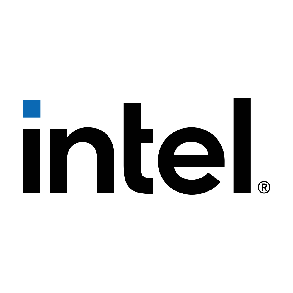
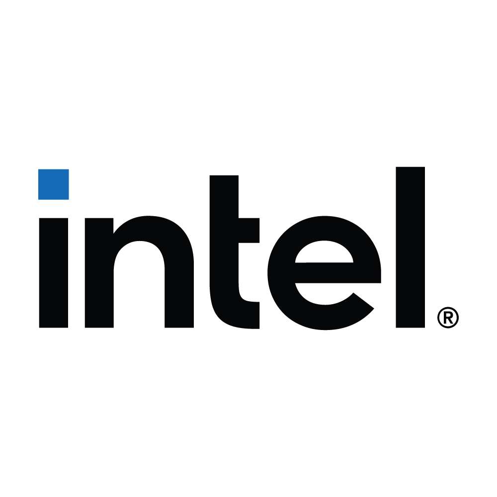
Intel 2020 New Logo
Intel, a Silicon Valley pioneer, has powered the digital revolution for over five decades. From the iconic x86 processors that run most of the world's computers to cutting-edge advancements in artificial intelligence and cloud computing, Intel has consistently pushed the boundaries of what's possible. Today, Intel continues to innovate, developing revolutionary technologies that will shape the future of how we live, work, and interact with the world around us.
Intel 2020 New Logo Download
Brand colour
Read from the vector file itself. See more Blue logos, or pull the full palette with the colour extractor.
Available formats
- SVG
- PNG
- JPG
- EPS
- AI
By downloading Intel 2020 New Logo you agree with intellectual property rights in our Privacy Policy.
Do more with the Intel 2020 New Logo
- Convert the Intel 2020 New Logo to PNG Render it at any size up to 4096px, with a transparent or solid background.
-
Make a favicon from the Intel 2020 New Logo
Every size a site needs, plus a ready-to-use
favicon.ico. - Get the Intel 2020 New Logo colour palette Exact HEX, RGB and HSL values, with contrast ratios for accessible text.
More free logos by format: Free SVG Logos, Free PNG Logos with Transparent Backgrounds, Free EPS Logos for Print and Design, Free AI Logos for Adobe Illustrator
Intel 2020 New Logo — frequently asked questions
A Bold Refresh: Exploring Intel's 2020 Logo Revamp
In 2020, tech giant Intel unveiled a modernized version of its iconic logo. This change marked a significant shift in the company's visual identity, reflecting a renewed focus on innovation and a commitment to the future. Let's delve into the details of the 2020 Intel logo and its significance for the brand.
A Legacy of Innovation:
Intel's logo has undergone several transformations throughout its history, but it has always retained a sense of strength and reliability. The pre-2020 logo featured a prominent blue "e" with a bold, circuit-like element above it. This imagery alluded to the company's core business – processors and integrated circuits.
A New Era of Technology:
The 2020 logo represents a departure from the previous circuit motif. The updated design features a sleeker, more squared-off typeface with a focus on clean lines and negative space. The iconic blue color remains, signifying brand continuity.
This shift in aesthetics reflects Intel's embrace of a broader technological landscape. The company is now a major player in areas like artificial intelligence, cloud computing, and the Internet of Things (IoT). The simplified logo design better reflects this diversification, showcasing a more versatile and future-oriented Intel.
The Impact of the Rebrand:
The 2020 logo revamp wasn't just a cosmetic change. It signaled a strategic move by Intel to solidify its position as a leader in the ever-evolving tech industry. The streamlined design resonates with a modern audience and better aligns with Intel's current brand identity.
A Look Forward:
The 2020 logo serves as a visual representation of Intel's commitment to progress and adaptation. As technology continues to advance, Intel's brand identity will likely continue to evolve alongside it. However, the core values of innovation, performance, and reliability that the Intel logo embodies will undoubtedly remain a constant.