The KitKat logo, iconic for its association with the famous chocolate-covered wafer bar, has undergone several evolutions since its inception. Introduced in 1935, the original design featured a straightforward, bold script highlighting the product's name. By the 1940s, the logo adopted a more stylized, cursive font encapsulated within an oval to enhance brand recognition. The most notable redesign occurred in the late 1980s, aligning with KitKat's global expansion; the logo was streamlined to a cleaner, more modern look, featuring a bright red background and white text for high visibility and instant recognition. This version has remained broadly consistent, solidifying KitKat's identity as a beloved global snack.

By downloading logo kitkat you agree with intellectual property rights in our Privacy Policy.
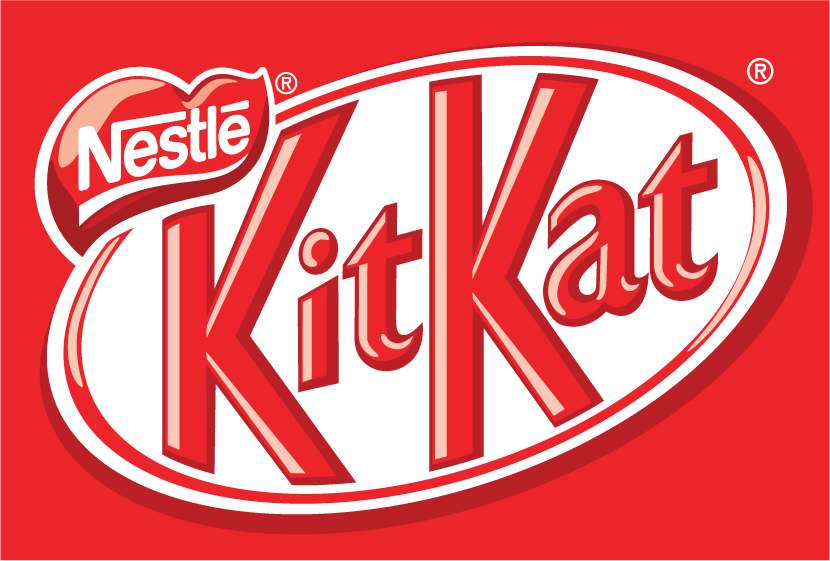
The Kit Kat logo is as recognizable as the satisfying snap of its chocolate bar. But did you know this candy bar's logo has a rich history, much like the chocolate?
The journey began in 1935 with the launch of Rowntree's Chocolate Crisp. The original logo featured simple white lettering against a bold red background. It was elegant and eye-catching, reflecting the design trends of the era.
World War II brought about a brief change. Due to wartime limitations, a dark chocolate version called the "Blue Label Kit Kat" was introduced. The logo mirrored this shift, swapping the red for a bright blue.
After the war, the classic red background returned, and the brand name "Kit Kat" took centre stage. The logo has remained remarkably consistent ever since, a testament to its timeless design.
The Kit Kat logo is more than just a pretty face. The red colour is associated with energy and excitement, perfectly capturing the satisfying break a Kit Kat offers. The bold white lettering ensures clear brand recognition, making it stand out on shelves worldwide.
The logo has been a constant companion, from the original Chocolate Crisp to the modern Kit Kat with variants like dark chocolate. It represents a delicious tradition, a quick pick-me-up that's become a global icon.
So, take a break with a Kit Kat next time you take a break to appreciate its logo. It's a simple yet powerful symbol of a chocolate bar that's stood the test of time.


