rolling stones logo
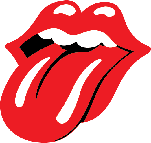
The iconic Rolling Stones logo, featuring protruding lips and a distinctive tongue, has become synonymous with rock 'n' roll rebellion and swagger since its creation in 1971. The logo was initially commissioned for the band's Sticky Fingers album cover and was designed by John Pasche, a young art student. Drawing inspiration from Mick Jagger's charismatic persona and the band's rebellious ethos, Pasche's design captured the essence of the Stones' music and attitude. Its bold simplicity and provocative imagery have ensured its enduring appeal, making it one of popular culture's most recognizable and enduring logos.
"Rocking through generations 🎸👅"
rolling stones logo Download
Brand colour
Read from the vector file itself. See more Red logos, or pull the full palette with the colour extractor.
Available formats
- SVG
- PNG
- JPG
- EPS
- AI
By downloading rolling stones logo you agree with intellectual property rights in our Privacy Policy.
Do more with the rolling stones logo
- Convert the rolling stones logo to PNG Render it at any size up to 4096px, with a transparent or solid background.
-
Make a favicon from the rolling stones logo
Every size a site needs, plus a ready-to-use
favicon.ico. - Get the rolling stones logo colour palette Exact HEX, RGB and HSL values, with contrast ratios for accessible text.
More free logos by format: Free SVG Logos, Free PNG Logos with Transparent Backgrounds, Free EPS Logos for Print and Design, Free AI Logos for Adobe Illustrator
rolling stones logo — frequently asked questions
The Rolling Stones Iconic Logo: A Tongue That Rocked the World
The Rolling Stones are a legend in rock and roll, and their logo is just as iconic. But how did this now-famous symbol come to be? Let's delve into the story behind the Rolling Stones logo, which goes back to 1970.
From Art Student to Rock Royalty:
Our story begins with John Pasche, not a seasoned designer but a young art student at the Royal College of Art in London. The Stones, then led by the flamboyant Mick Jagger, were looking for a logo for their new record label, Rolling Stones Records. They reached out to the college, and fatefully, Pasche's name landed on their desk.
Inspiration Strikes:
Pasche's initial concept was to create a simple logo for a program cover or press book. Think paper, not a rock concert t-shirt! He even took inspiration from the Hindu goddess Kali for a more multi-armed design. But then came the magic touch—the now-famous tongue-and-lips logo.
A Symbol of Rebellion:
Some say the tongue and lips inspired by Mick Jagger's pout were a stroke of genius. They were bold and brash and perfectly captured the rebellious spirit of rock and roll. This wasn't just a logo; it was a symbol.
A Legacy in Red:
Initially created for a small fee, Pasche's design has stood the test of time. The red tongue and lips have become synonymous with the Rolling Stones, appearing on everything from albums to merchandise. It's a testament to the power of a well-designed logo – simple, memorable, and reflecting the brand's essence.
Fun Facts:
- The original logo artwork was actually bought by the Victoria and Albert Museum in London for a whopping sum, proving its artistic merit.
- John Pasche wasn't the only art student to brush shoulders with rock and roll royalty. Craig Braun, who would later become Mick Jagger's manager, was simultaneously a student at the Royal College of Art!
- The Rolling Stones logo is often called "Hot Lips," or the "Stones tongue and lip," but its official name is simply the Rolling Stones logo.
So next time you see the Rolling Stones' iconic tongue and lips, remember the story behind it – a tale of an art student, rock and roll legends, and a logo that has become a permanent fixture in music history.