
By downloading Watford Football Club Logo you agree with intellectual property rights in our Privacy Policy.
Watford Football Club, also known as the Hornets, boasts a rich history that's reflected in the evolution of its logo. This article delves into the various crests and badges donned by Watford FC over the years, offering a glimpse into the club's identity and its connection to its hometown.
Watford FC's first foray into badge design was a simple yet bold statement. Introduced in 1927, the initial badge was a shield emblazoned with the club's initials, "WFC." This straightforward design laid the foundation for future iterations.
The post-war period saw a shift in Watford FC's logo. In the 1950s, a new crest incorporated the club's initials, a football, and the head of a hart, a male fallow deer. The hart symbolized the club's location in Hertfordshire, the only league club from the county at the time (until Barnet and Stevenage joined later).
For a short period in 1959, Watford FC revisited the shield design. This version featured the initials alongside a football, hinting at the club's focus on the beautiful game.
In 1961, Watford FC took inspiration from the Watford Borough Council's coat of arms. This badge, named "Audentior" (meaning "To Dare" in Latin), incorporated elements like a golden wyvern and a red rose. However, it wasn't destined to last.
The year 1968 marked a significant shift in Watford FC's visual identity. The club introduced a new badge featuring a red hornet, a nod to their newly adopted nickname, "The Hornets." This marked the beginning of a connection that continues to this day.
Watford FC further embraced their hornet mascot in 1974. A new badge featured a cartoon version of the hornet, adding a touch of playfulness and personality to the club's image.
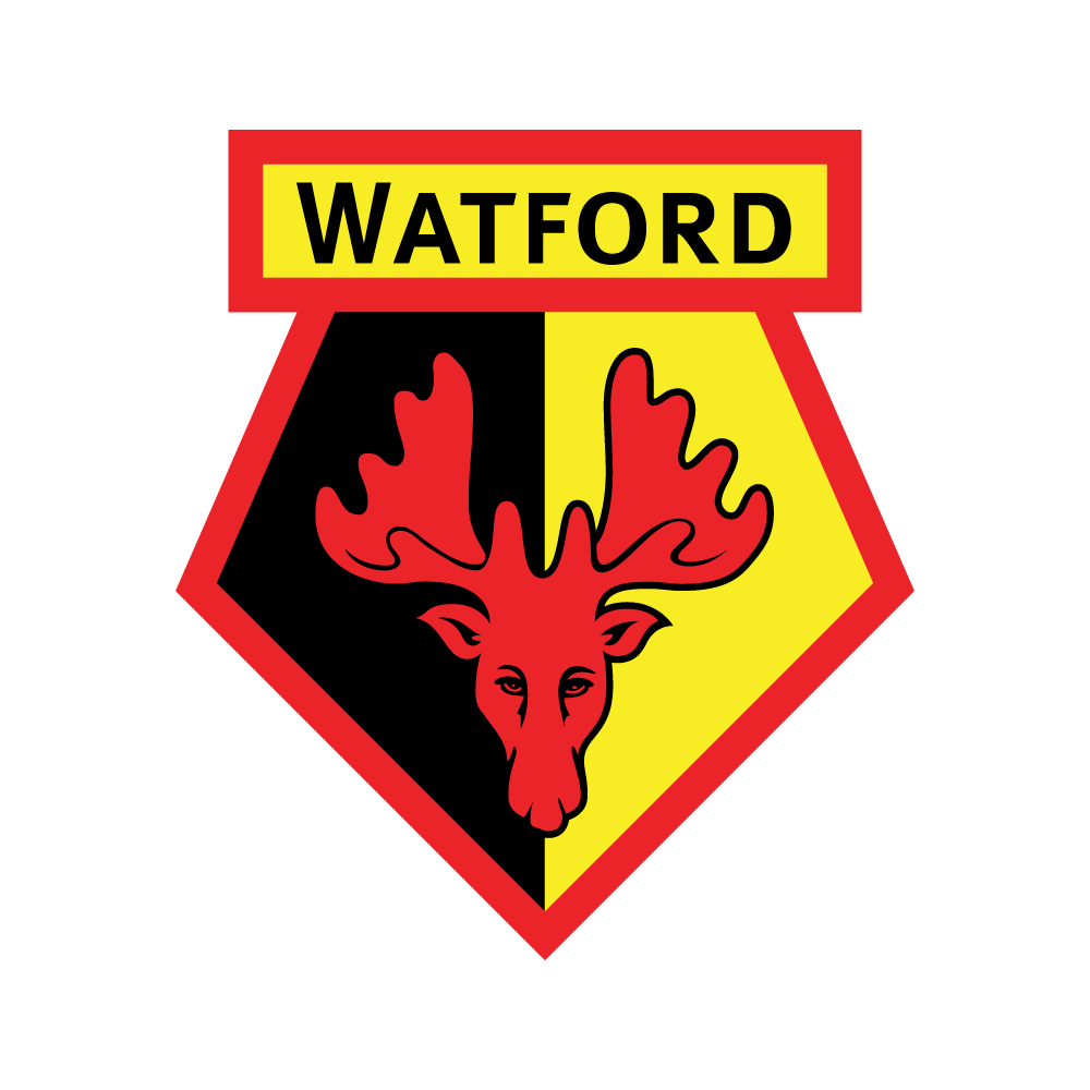
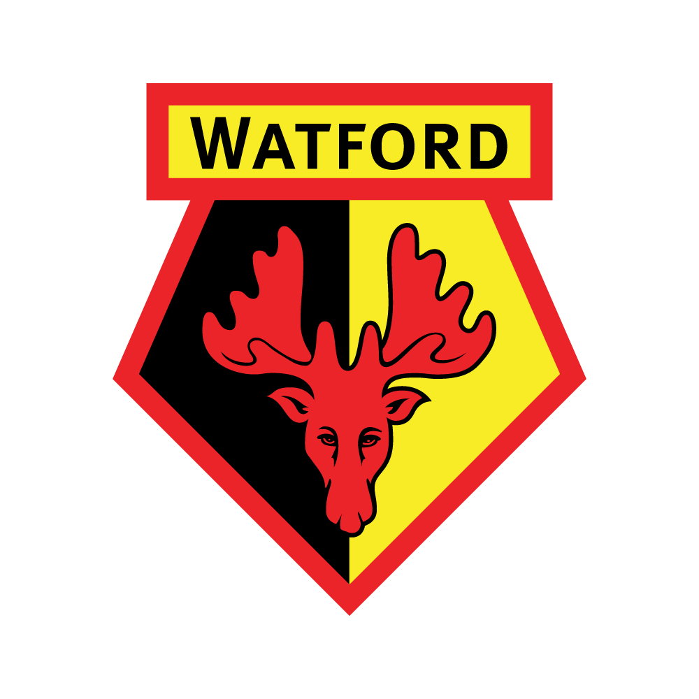
Alongside the cartoon hornet, 1974 also saw the introduction of a new crest shape that remains the foundation of Watford FC's logo today. This iconic design, refined in 2002, features a bold yellow and black color scheme, incorporating the club's name and a stylized hornet within the crest.
The evolution of Watford FC's logo is a fascinating journey that reflects the club's history and its connection to its fans and community. From the simple shield to the iconic hornet crest, each iteration tells a story, solidifying Watford FC's unique identity within the world of football.


