Ferrari is an Italian luxury sports car manufacturer based in Maranello, Italy. Founded in 1939 by Enzo Ferrari as Scuderia Ferrari, which raced in Formula One races, Ferrari built its first car in 1940. Ferrari produced its first street-legal production vehicle in 1947. The company has been involved in Formula One since 1950, and has won 16 Constructors' Championships and 15 Drivers' Championships, making it the most successful team in Formula One history. Ferrari is also known for its high-performance sports cars, which are often considered to be among the most desirable in the world.
"Unleashing speed and sophistication 🏎️💨🔥"

By downloading ferrari logo design you agree with intellectual property rights in our Privacy Policy.
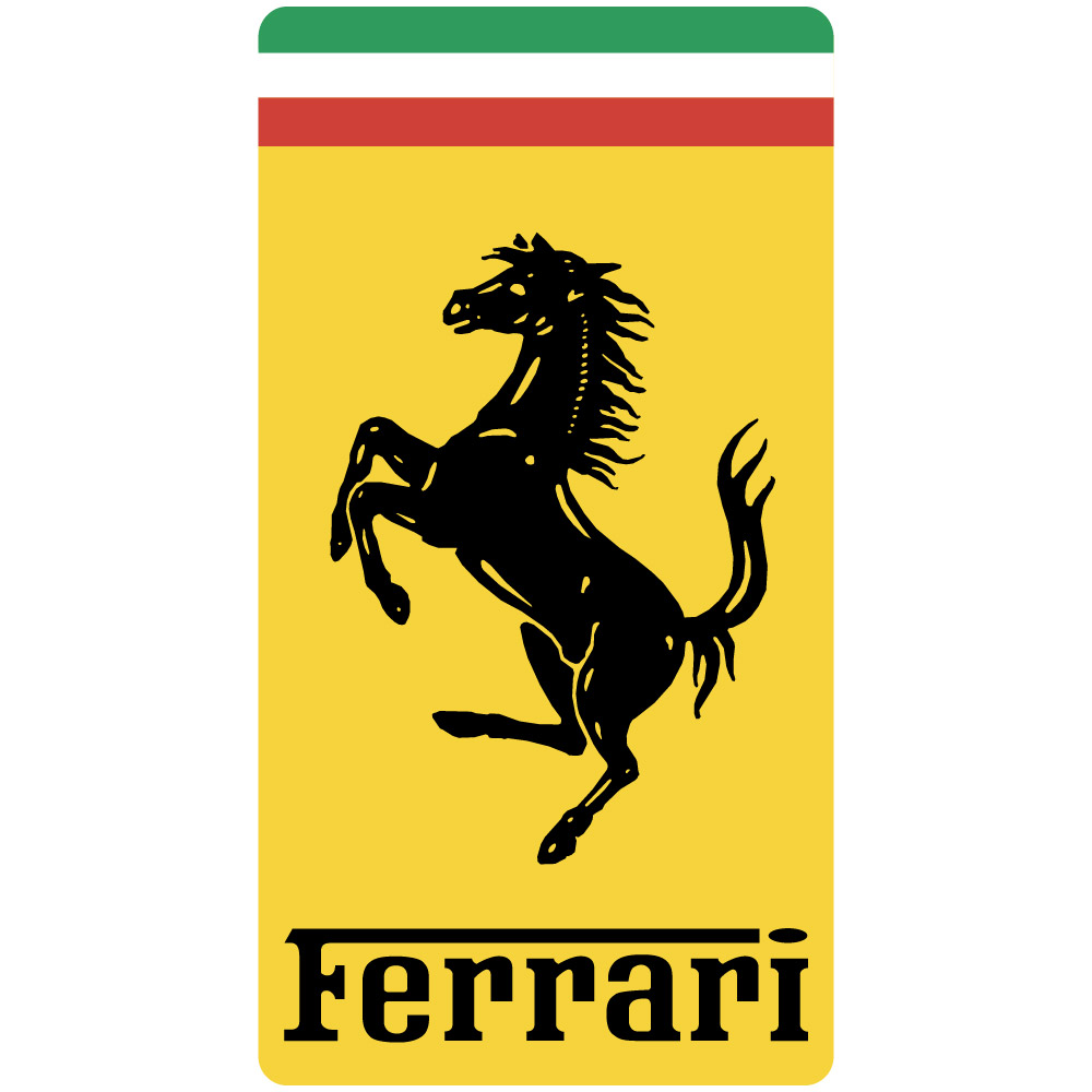
The iconic Ferrari logo, instantly recognizable with its prancing black horse on a yellow background, is more than just a car company emblem. It's a symbol of speed, luxury, and Italian racing heritage. But how did this logo come to be? Let's delve into the fascinating story behind the Ferrari logo design.
The story begins with Count Francesco Baracca, a legendary Italian World War I fighter pilot. Baracca adorned his aircraft with a cavallino rampante (prancing horse) emblem. Sadly, Baracca fell in battle. His friend, Enzo Ferrari, a rising star in the racing world, vowed to keep the cavallino rampante alive.
Enzo Ferrari adopted the prancing horse for his racing team, Scuderia Ferrari, in 1929. However, the original Baracca emblem featured a black horse on a white background. Ferrari made key modifications. He tilted the horse slightly and placed it on a vibrant canary yellow background. This yellow was actually the color of Modena, Ferrari's birthplace, signifying local pride.
The addition of the scudo (shield) and the tricolor (Italian flag) further enriched the logo design. The shield, originally white, had a blue stripe added later. Legend has it that Countess Paolina Baracca, Francesco's mother, suggested using the Italian flag for good luck. This association with Italian racing heritage continues to this day.
The prancing horse logo wasn't always black. In the early days, the horse appeared in different colors, including red (like the Alfa Romeo logo, a former employer of Ferrari). However, black eventually became the dominant color, solidifying the iconic image we know today.
The Ferrari logo design is a masterpiece of simplicity and power. The prancing horse evokes a sense of speed and dynamism, perfectly reflecting the spirit of Ferrari cars. The logo's enduring popularity is a testament to its timeless design and the enduring legacy of Enzo Ferrari's vision.
So, the next time you see a Ferrari car zoom by, take a moment to appreciate the logo – a story of friendship, bravery, and the pursuit of speed, all encapsulated in a single prancing horse.


