
By downloading Nestle Kit Kat Logo you agree with intellectual property rights in our Privacy Policy.
Delve into the world of sweetness and design as we unwrap the story behind the iconic Nestle Kit Kat logo. Much like the satisfying snap of breaking off a piece of this beloved chocolate wafer, the logo carries a rich history and symbolism that has become synonymous with the Kit Kat experience. Join us on a journey through time and design as we explore the elements that make the Nestle Kit Kat logo a true masterpiece.
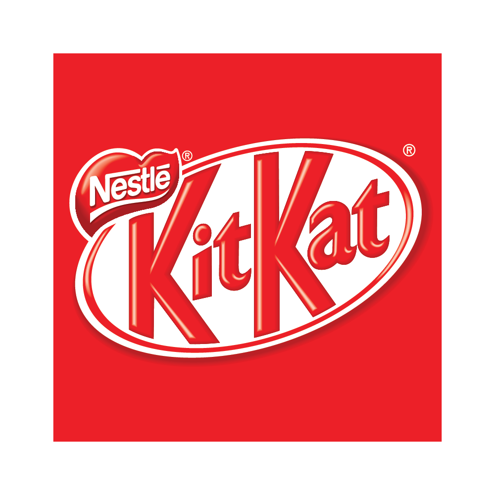
The Nestle Kit Kat logo has evolved over the years, reflecting the brand's commitment to innovation while staying true to its roots. The journey began in the 1930s when Rowntree's, a British confectionery company, introduced the Kit Kat chocolate bar. The original logo featured a distinctive red background with bold, white lettering, creating a visual identity that was both striking and memorable.
As the brand changed hands and Nestle took over in the 1980s, the Kit Kat logo underwent subtle transformations. The red and white colour scheme remained a constant, symbolizing the classic combination of milk chocolate and crispy wafers. The typography was refined, creating a more modern and timeless look that resonates with consumers of all ages.
Beyond its visual appeal, the Nestle Kit Kat logo carries subtle symbolism. The red wrapper embodies warmth, energy, and passion, creating a sense of excitement around the product. The crisp, white lettering signifies purity and the delightful crunch of the wafer inside, creating a harmonious balance that speaks to the product's essence.
One of the remarkable aspects of the Nestle Kit Kat logo is its consistency across international markets. Whether enjoying a Kit Kat in Tokyo, London, or New York, the familiar red and white design instantly connects consumers to the brand, creating a sense of global unity through a shared love for this delicious treat.
In conclusion, the Nestle Kit Kat logo is not just a visual identity; it's a testament to the brand's enduring legacy and the universal joy that comes with each bite of a Kit Kat bar. From its humble beginnings in the 1930s to its global prominence today, the logo has stood the test of time, becoming a symbol of sweet indulgence and a break from the routine. So, the next time you snap off a piece of Kit Kat, take a moment to appreciate the artistry behind the logo that has been delighting chocolate lovers for generations.


