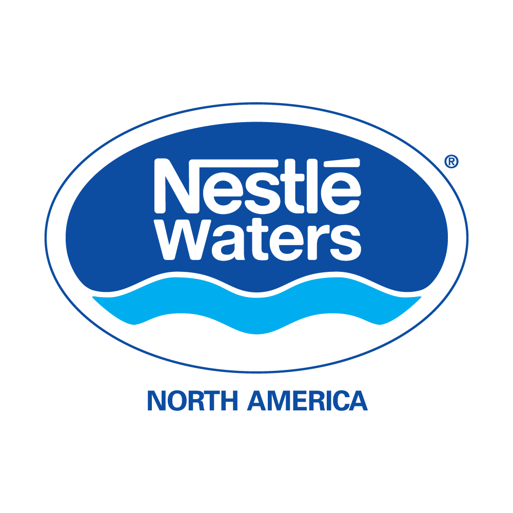
Discover the story behind the iconic Nestle Waters logo, a symbol that embodies purity, quality, and innovation in the world of bottled water. Nestle Waters, a renowned brand recognized globally for its commitment to delivering pristine water, has crafted a logo that speaks volumes about its values and dedication. Let's delve into the significance and design elements that make the Nestle Waters logo a distinctive mark in the beverage industry.
Understanding the Nestle Waters Logo
The Nestle Waters logo is a visual representation of the brand's mission to provide pure, refreshing water to consumers around the world. Comprising a combination of colors, shapes, and symbols, this emblem captures the essence of Nestle Waters' commitment to quality and sustainability.
Key Design Elements
Blue DominanceThe predominant use of blue in the Nestle Waters logo reflects the purity and clarity of the water the brand offers. Blue is a color often associated with tranquility and cleanliness, making it a perfect choice to convey the brand's dedication to providing premium water products.
Flowing Water Symbolism
The subtle wave-like patterns incorporated into the logo symbolize the flowing, natural source of Nestle Waters. This design element not only adds a touch of elegance but also conveys the brand's commitment to sourcing water from pristine environments.
Nestle Logo Integration
The Nestle Waters logo is seamlessly integrated with the overarching Nestle brand logo, creating a sense of unity and trust. This integration reinforces the association with Nestle's reputation for quality and reliability.
Green Accents for Sustainability
Nestle Waters places a strong emphasis on sustainability, and this is reflected in the logo through the use of green accents. The touch of green signifies the brand's commitment to eco-friendly practices, including responsible water sourcing and packaging.
Why the Nestle Waters Logo Matters
The Nestle Waters logo is more than just a visual mark; it's a representation of the brand's values and its promise to consumers. In a market saturated with beverage choices, the logo serves as a beacon, guiding consumers toward a brand that prioritizes purity, sustainability, and innovation.
Conclusion
As we unravel the layers of the Nestle Waters logo, it becomes evident that every element has been carefully chosen to convey a message of trust, quality, and environmental responsibility. The Nestle Waters logo stands as a testament to the brand's commitment to providing not just water but a symbol of purity and excellence in every drop.


