Ryanair's logo has undergone several transformations since the airline's inception in 1984. Initially featuring a bold blue and yellow design with a stylized 'R', it represented the airline's energetic and budget-friendly approach. Over the years, the logo has evolved to reflect Ryanair's growth and modernization, transitioning to a sleeker and more minimalist look. Today, the emblem boasts a simple yet recognizable motif, with the company name in lowercase letters and a distinctive harp symbol. This design shift aligns with Ryanair's commitment to simplicity and efficiency, mirroring its no-frills approach to air travel while maintaining a solid brand identity in the competitive aviation industry.
"Fly with Ryanair ✈️ for budget-friendly adventures around Europe! 🌍 #TravelSmart"

By downloading Ryanair Logo you agree with intellectual property rights in our Privacy Policy.
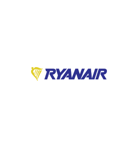
Ryanair, the Irish low-cost airline giant, is known for its bright blue and yellow branding. But have you ever stopped to think about the meaning behind their logo?
The centrepiece of the Ryanair logo is a bold yellow harp. This is more than just a decorative element; it's a nod to Ireland's national symbol. The harp has been associated with Ireland for centuries, representing the country's rich history and cultural heritage.
Look closer, and you'll see the harp's strings cleverly form the silhouette of a person with outstretched arms. This figure evokes a sense of flight, symbolizing the freedom and ease of travel Ryanair promises its passengers.
The colour choices in the Ryanair logo are also significant. The blue background represents trust, security, and reliability - crucial for any airline. The bright yellow harp adds a touch of energy and optimism, reflecting the exciting possibilities of exploring new destinations.
Ryanair's logo is an excellent example of effective design. It's simple, memorable, and conveys a clear message about the brand. The combination of the iconic Irish symbol and the image of flight makes a lasting impression and embodies the airline's core values.
So, next time you see a Ryanair aeroplane, take a moment to appreciate the logo's subtle details and the story it tells about Irish heritage and the joy of travel.


