The Toyota logo isn't just a simple emblem; it's a symbol that carries layers of significance and history. Delving into its design unveils a fascinating narrative of Toyota's identity, values, and cultural heritage. From its inception to its current iteration, each logo element reflects this automotive giant's essence, encapsulating innovation, reliability, and global reach. Understanding the Toyota logo's meaning provides a unique insight into the brand's journey and its profound global impact on the automotive industry.

By downloading toyota logo meaning you agree with intellectual property rights in our Privacy Policy.
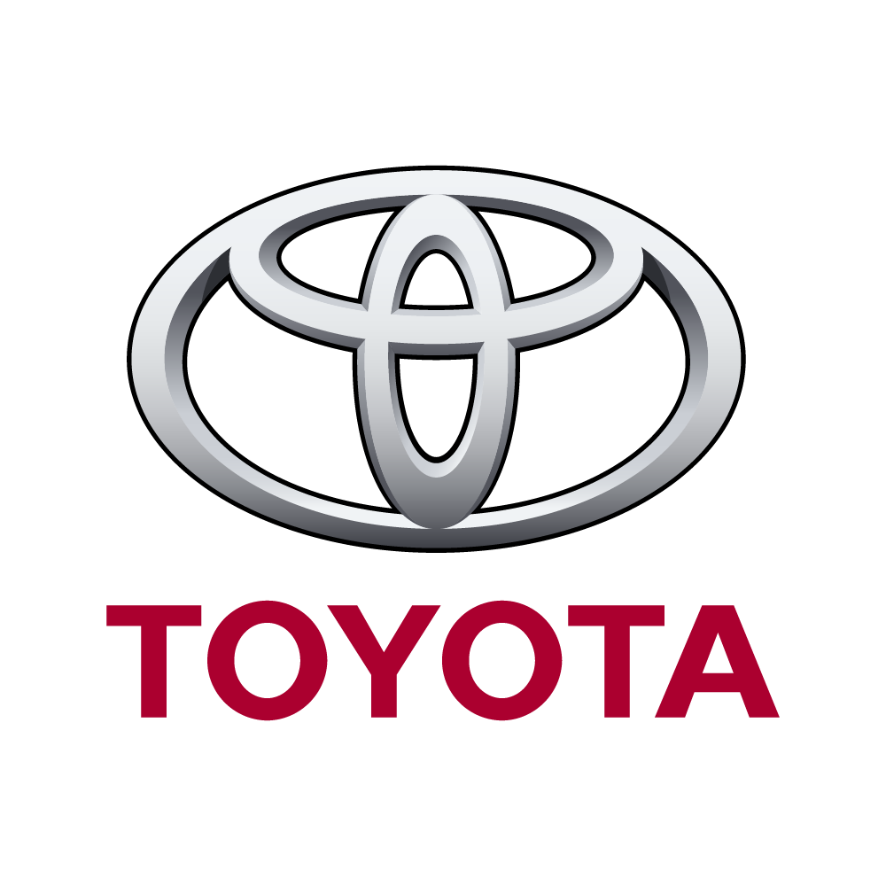
The Toyota logo, a seemingly simple design of interlocking ovals, is a powerful symbol recognized worldwide. But did you know this iconic emblem holds a deeper meaning? Let's explore the fascinating story behind the Toyota logo and what it represents.
While the logo isn't rendered in fonts like Times New Roman or sans serif, its design principles reflect timeless appeal. Created in 1989, the Toyota logo wasn't simply about aesthetics but about conveying the brand's core values.
The logo features three ellipses cleverly combined. The two inner ovals, entwined seamlessly, represent the hearts of Toyota and its customers. This overlap signifies the mutual trust and beneficial relationship the brand strives to build with every driver.
Encompassing these inner ovals is a larger ellipse. This outer shape symbolizes the world embracing Toyota, reflecting the brand's global presence and reach.
Interestingly, the ovals are drawn with varying line thicknesses, reminiscent of traditional Japanese calligraphy. This subtle detail is a nod to Toyota's rich heritage and commitment to continuous improvement.
The negative space within the logo is just as significant. It represents the infinite values that Toyota aspires to deliver to its customers. These values encompass quality, innovation, safety, environmental responsibility, and the pure joy of driving.
Though it still needs to celebrate its 50th anniversary (established in 1989), the Toyota logo has stood the test of time. Its enduring design reflects the brand's commitment to building solid relationships, constant improvement, and a dedication to a future filled with mobility for all.


