
By downloading Warner Brothers Logo you agree with intellectual property rights in our Privacy Policy.
The Warner Bros. logo is an iconic symbol instantly recognized by moviegoers worldwide. For over a century, it has heralded the arrival of countless films and television shows, solidifying Warner Bros. as a titan in the entertainment industry. Let's delve into the history and evolution of this legendary logo.
The Warner Bros. logo is rooted in the story of four brothers: Harry, Albert, Sam, and Jack Warner. In 1923, they founded Warner Bros. Pictures, a film production company. By 1929, they had established themselves as a major Hollywood player.
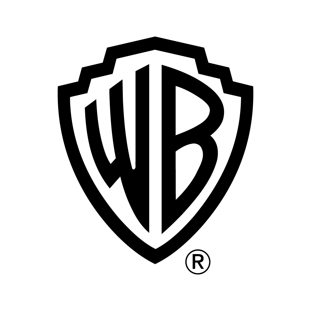
The now-iconic shield logo was introduced in 1929. It featured a blue shield emblazoned with the initials "WB" in gold. The shield itself was said to symbolize strength and protection, while the initials represented the Warner brothers themselves.
The logo received a significant update in 1948. The design team streamlined the shield, giving it a more modern and elegant look. The color scheme was also tweaked, with the blue becoming a richer shade and the gold adopting a more vibrant tone. This 1948 iteration of the logo is the one most people recognize today.
Warner Bros. has continued to refine its logo over the years, but the core elements – the shield and the "WB" initials – have remained constant. In 2019, the company introduced a new variation with a solid blue crest and white "WB" initials. This version retains the classic shield shape but offers a more modern and minimalist aesthetic.
Warner Bros. has expanded far beyond its film production roots. Today, the company encompasses a vast entertainment empire, including television networks, animation studios, and video game development. The Warner Bros. logo continues to serve as a unifying symbol across all these diverse branches.
The Warner Bros. logo is more than just an image; it's a symbol of Hollywood history and a testament to the enduring power of storytelling. As the company continues to evolve, one thing remains certain: the Warner Bros. shield will continue to be a beacon for entertainment enthusiasts worldwide.


