The McLaren logo has evolved significantly since the company's inception in 1963 by Bruce McLaren. Initially featuring a Kiwi bird, symbolizing Bruce's New Zealand heritage, the logo underwent several transformations before settling into its current form. Today, it's a streamlined, stylized rendition of a speedy 'McLaren Speedmark,' embodying the brand's relentless pursuit of performance and innovation. Its sleek design and vibrant red color capture the essence of speed and precision, reflecting McLaren's illustrious racing heritage and its commitment to pushing the boundaries of automotive excellence.
"Speeding into the future 🏎️💨 – McLaren's iconic emblem."

By downloading McLaren Logo you agree with intellectual property rights in our Privacy Policy.
The iconic McLaren logo, proudly displayed on Formula One racers and high-performance vehicles, has a fascinating history. It's a story that reflects not just the brand's racing heritage but also its founder's national pride.
The very first McLaren logo featured a silhouette of a kiwi, the national bird of New Zealand. This unique choice was a tribute by founder Bruce McLaren to his homeland. The logo resembled a badge, with the kiwi nestled amongst racing stripes.
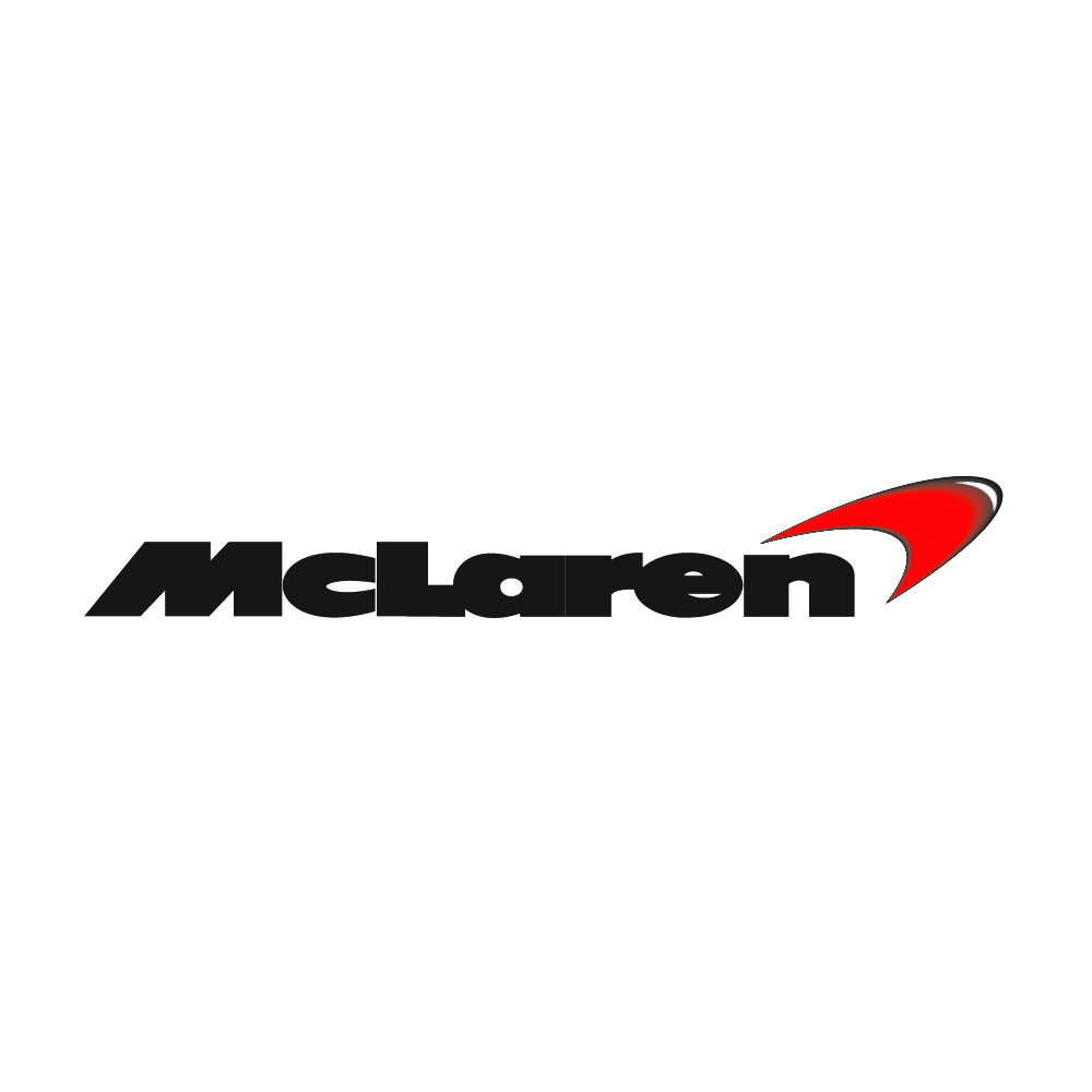
Over time, McLaren's logo went through a transformation. The focus shifted from the kiwi to a symbol of speed. In 1997, a streamlined design emerged, featuring a single, red, and black checkered chevron. This logo, often referred to as the "McLaren swoosh," captured the essence of speed and power associated with the McLaren brand.
McLaren has also utilized a black and white speedmark logo. This minimalist design served to unify the various branches of the McLaren Group, showcasing their collective identity under one powerful brand.
While the black and white logo signified unity, the heart of McLaren lies in racing. This passion is reflected in their return to the iconic "McLaren orange" racing livery, also known as "papaya." This vibrant color scheme complements the bold swoosh logo, creating an instantly recognizable symbol in the world of motorsports.
The McLaren logo is more than just an image; it's a journey through the brand's heritage. From the humble kiwi to the dynamic swoosh, it reflects a commitment to innovation, speed, and a touch of national pride.


