A major player in the global consumer electronics market, Xiaomi has carved a niche for itself by offering high-quality products at competitive prices. Founded in China, the company has rapidly expanded its reach, becoming the world's second-largest smartphone manufacturer. Beyond smartphones, Xiaomi boasts a diverse product portfolio encompassing everything from smart TVs and laptops to home appliances and electric scooters. Renowned for its innovative approach and commitment to user experience, Xiaomi continues to be a force to be reckoned with in the ever-evolving tech landscape.

By downloading Xiaomi 2021 New Logo you agree with intellectual property rights in our Privacy Policy.
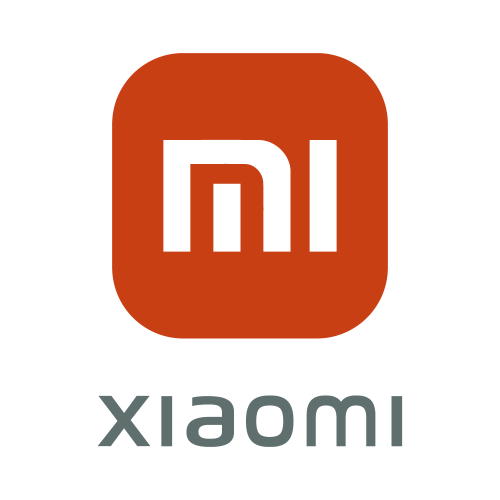
In 2021, Xiaomi, the popular Chinese tech giant, introduced a subtle yet significant update to its brand identity – a new logo. This change marked a shift towards a more modern and streamlined aesthetic, reflecting the company's continued evolution.
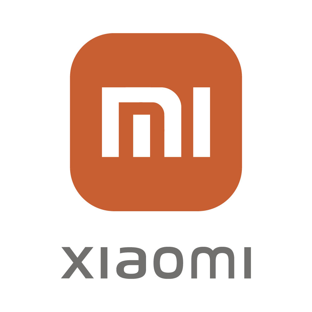
Prior to 2021, the Xiaomi logo featured a squared orange icon with the brand name "Xiaomi" written in black below it. This design served the company well for many years, but as Xiaomi expanded its global reach and product portfolio, a refresh was deemed necessary.
The 2021 logo retained the core elements of the original - the orange color and the brand name - but with a key difference: the corners of the orange icon were softened, creating a more rounded and contemporary look. This subtle change, designed by world-renowned designer Kenya Hara, aimed to convey a sense of dynamism, flexibility, and growth, aligning with Xiaomi's forward-thinking approach.
Kenya Hara utilized the mathematical formula for a superellipse to achieve the new logo's balanced shape. This formula allowed for infinite variations between a perfect square and a circle. By choosing a specific value within the formula, Hara struck the ideal balance – a shape that embodied the concept of "Alive." This concept signified the increasingly intertwined relationship between humans and technology, perfectly in line with Xiaomi's mission to integrate technology seamlessly into everyday life.
The new Xiaomi logo was met with generally positive feedback. Many praised the subtle yet effective update, finding it more modern and aesthetically pleasing. The logo change also reflected Xiaomi's continued commitment to innovation and staying at the forefront of the tech industry.
The Xiaomi logo, both old and new, serves as a recognizable symbol of the company's dedication to quality, affordability, and innovation. The 2021 update signifies Xiaomi's ongoing evolution and its commitment to remaining a relevant and dynamic force in the global tech landscape.


