
By downloading St. Louis Blues Logo you agree with intellectual property rights in our Privacy Policy.
The St. Louis Blues, a prominent team in the National Hockey League (NHL), boast a logo as iconic as their energetic brand of ice hockey. But this instantly recognizable blue note goes beyond mere aesthetics; it's a symbol steeped in the team's history and the city's vibrant culture.
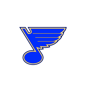
Founded in 1967 as part of the NHL's expansion, the St. Louis Blues drew inspiration for their name from W.C. Handy's legendary blues song, "Saint Louis Blues." It was only fitting, then, that the logo would reflect this musical connection. The first iteration, introduced in the same year, featured a bold, stylized blue note with a hockey stick forming the stem. This logo remained the primary emblem for over two decades, solidifying its place in Blues lore.
The St. Louis Blues logo has undergone subtle refinements over the years. In 1994, a sleeker, more modern design replaced the original. The blue note retained its central focus, but the lines became sharper, and the overall look felt more streamlined. This logo continues to be the team's primary emblem, appearing on jerseys, merchandise, and at the center ice of their home arena.
The St. Louis Blues have experimented with alternate logos throughout their history. Most notably, a secondary logo featuring the iconic Gateway Arch superimposed on the blue note emerged in 2008. This design served as a powerful symbol of civic pride, tying the team to the city's unique identity.
The St. Louis Blues logo transcends mere visual representation. It embodies the team's spirit, their connection to the city, and their dedication to excellence in the world of ice hockey. The Stanley Cup victory in 2019 stands as a testament to the unwavering support fans have shown for their beloved blue note.
So, the next time you see the St. Louis Blues logo, remember that it's more than just a design. It's a symbol of a passionate team, a dedicated fanbase, and a city with a rich musical heritage, all woven together by the threads of NHL hockey.


